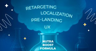
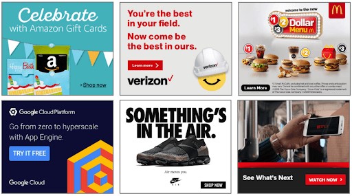
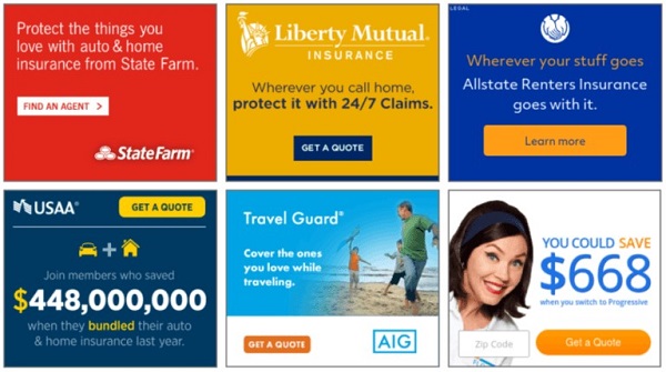
The promotion of any product is inextricably linked with advertising. It doesn’t matter how cool the logo, beautiful packaging design and how cool the product is. Without banners, no one will simply see it – there will be no touch points, which means sales.
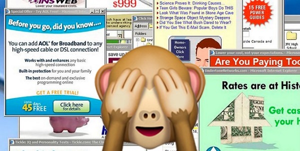
A bad banner will not give a result. Users will ignore it, perhaps they won’t even notice it (banner blindness is a serious problem for marketers). Some ads are designed in such a way that it would be better not to notice it – an absurd slogan, too provocative design can affect the feelings, providing the opposite effect.
Teams of designers are engaged in the development of banners for large companies, from Apple to H&M. But if you are launching a small project or are engaged in affiliate marketing, it is not necessary to pay thousands of dollars for the services of creatives. You can do everything yourself. You need to know the basic principles of design development and master several simple and FREE applications.
This is the Leadbit team with you and today in the review we will learn how to create cool advertising banners for promotion on the Internet.
Table of contents
Banner design: why is it necessary, isn’t it easier to copy someone else’s?
Anyone who has started studying the topic will naturally ask: why do something that can be copied using SPY services? Or look through the search engine. For affiliate marketers working with partner programs, everything seems even easier – we take ready-made banners. But first, ask the question: will this banner work, will it pay off the cost of clicks or impressions?
There are several reasons why you should not steal “take” someone else’s advertising materials or ready-made templates:
- banner blindness – banners that you copy through a spyware program have already worked out part of the audience, your effectiveness will be lower or not at all;
- you are competing with other “smart guys” who are used to using someone else’s. The potential of the audience is limited, clicks are divided between competitors, the conversion rate is lower;
- who said that other people’s banners are perfect? Often they are made up by affiliate marketing in a hurry and are quite mediocre. After spending a little time on the design, you can increase the conversion several times;
- It is difficult to adhere to the corporate style. Using someone else’s banners, you can create incorrect associations with your brand among potential customers.
Banner – an effective and fast way of communicating with the audience. If you want to attract new customers who are unfamiliar with the brand (partner product), this is actually the only point of contact. A lot depends on it. We know: “they meet by their clothes”. The first impression is important, a poorly composed ad will spoil it for years (perhaps forever).
For publishers (participants of partner programs), reputation is not as important as the balance of effort spent/profit received. But it is this balance that can be improved by spending an extra 20-30 minutes on elaboration (and one design will be universal for several formats), and get a successful campaign for several weeks, possibly months with a higher conversion rate. At such a distance, even an increase of +20% will turn into a couple of thousand bucks. In practice, by changing a couple of elements, you can increase the reach by two, three, four times.
All of the above does not mean that you do not need to use other people’s ideas. Something good can always be improved, you can borrow an idea, create a masterpiece. Or by removing a few ridiculous elements, turn a mediocre and boring creative into a sales machine. (Read about this in Austin Cleon’s book “Steal as an Artist”)
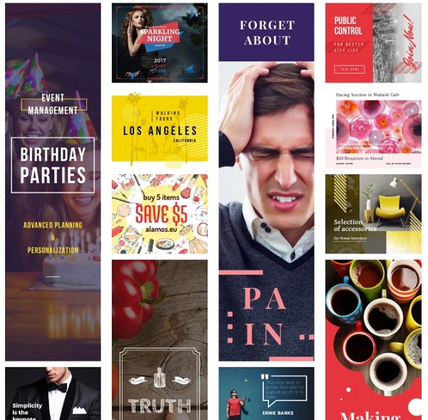
There are a lot of instructions on the Internet for the type: “this is a great banner, it combines colors well, the requirements of Facebook are taken into account” This is good, but damn, what does it all mean? Why is this particular banner ad cool, and not the one that is opposed as bad?
Before we understand the subtleties, we remember the axiom: “A good banner is the one that sells”. Sales are our goal. You can draw a whole picture or make a reproduction of the work of a famous artist, but if there are no sales, this is a bad creative. Top – if a person clicks after seeing the product for the first time.
Which banner will sell? – this is the right question. But there is no need to “discover America”. There are many studies of psychologists, marketers, biologists in this field. I sifted through tons of articles, in this review I squeezed out the important:
Proportions of the image and text
When launching an advertising, I want to tell you in detail about the product, convince the client. In practice, concise ads work best. No one likes to read a lot, delve into the subtleties. They don’t like advertising at all. It is necessary to attract attention, to interest from the first word. Ideal: a tenacious title of two or three words, a small sentence.
A bright indicator is the requirements of Facebook Ads. For most formats, the platform allows the text to occupy no more than 20%. The exception is pictures with the cover of a book, magazine, or product packaging. You can reduce the size of the letters, but it doesn’t make much sense. There is also a limit on the number of characters: 25 for the title, 90 for the slogan. Other advertising grids have less stringent requirements, but such restrictions are introduced for a reason. Facebook conducted research in 2015 and determined that such advertising works best. Therefore, we always try to comply with the standard or approach it.
How to make a cool call
Copywriting is the art of saying a lot, using a minimum of words. Too much information will make the banner look sloppy. It will be difficult for the user to catch the main message and he will ignore the colorful ad as another spam.
Studies confirm that the ideal number of words is no more than seven. Adding a new word on top reduces the conversion rate. It is not always possible to invest. But one thing is clear: a lot of text is bad.
How to make a cool text? Basic principles:
- be brief – people don’t have the time (or the desire) to read a lot;
- be clear – it is important to make it clear what you want from the first word;
- be honest – if you find an obvious deception, users will leave the landing page;
- use strong verbs: “get” instead of “you can get”, “increase sales” instead of “you can increase sales”;
- title as an action.
Use marketing approaches where you can assemble the text as a constructor. A convenient model is AIDA: Attention, Interest, Desire, Action. The principle of creating content:
- animation or catchy title;
- developing interest, focusing on the client’s wishes;
- a call to action (a button like “solve the problem”, “get a discounted product”, etc.).
Another model is PP: Pull Them In (bright title), Prove Your Case (denote the problem), Push Them To Act (call to action – click the button to solve it). Other marketing approaches: ACCA, 4C (4P), AIU.
For the header, you can use the 4U model: Useful, Ultra-specific, Unique, Urgent. Examples: “The top 5 online tools for banner development in 2021”. Or “5 new slots with a 99% return, which appeared in September”.
NLP (neuro-linguistic programming) methods work on some verticals. The simplest method is to ask a question to which the answer will be 100% (okay, 99.9%) positive. “Do you want to be happy?”, for business – “Do you want to reduce the cost of an accountant (security)?”, “Do you want to get a discount?”. But in no case do you formulate a question with a negative (“Would you like…?”). In this format, you don’t even need the main text. Just a title with a question and a CTA button: “Become happy”, “Take a discount”, “Get a consultation”.
Color – how it affects the audience
Do not underestimate the influence of the color scheme. The color can encourage you to click on the ad or, conversely, irritate you, forcing you to quickly close the ad. Some shades inspire confidence, others help to emphasize energy. They cause different associations – this is a good technique to let the user know without words what is going on.
The psychology of flowers is well studied. Using the right combinations is an easy way to evoke the right emotions. How do the primary colors affect:
- orange – sets up communication, stimulates rapprochement, the color of a holiday, friendliness. It is suitable for calling to action or promoting activities, from casinos to parties;
- gray – restraint, pedantry, accuracy. It is used by technology companies to emphasize the reliability of their products;
- purple – for some people it causes anxiety, for others it is an incentive that increases performance. We use the color carefully, it is suitable for promoting sports nutrition, energy drinks;
- blue – calms, relieves tension. A great color to inspire confidence. It is associated with reliability, it is often used by medical companies;
- black – helps to concentrate, in many countries it causes associations with premium products (black limousine, black watch), can be used if you need to emphasize premium;
- green (not bright) and white – neutral colors, can be used in the promotion of medical products, dietary supplements, products for children, animals.
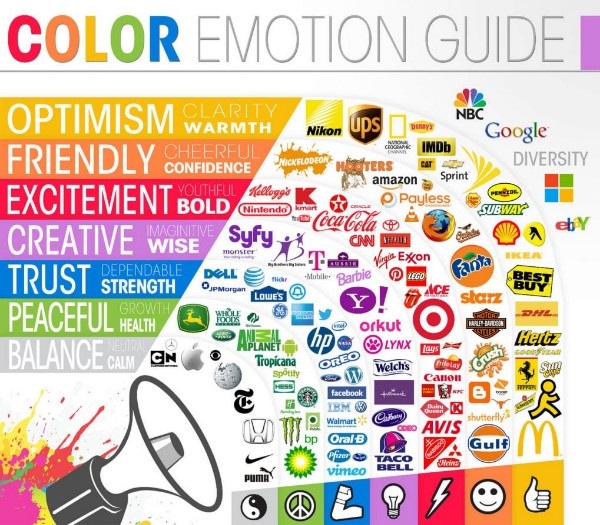
Play on the contrast: a combination of white and green, a yellow or orange call to action button (CTA) on a blue background. But do not turn the banner into a rainbow (only if it is not necessary to promote the brand). More than four colors, this applies to images and text, leads to a decrease in conversion.
Correct background
Conventionally, the backgrounds are solid (one color or gradient) and a photo background. There is always a temptation to add a beautiful photo, and with it – originality. But remember, our goal is efficiency. In most cases, a monochrome background works better, on which the text is well read. Ideally – light: white, blue, light emerald, or a gradient of white and orange, red…
In addition to the text on a plain background, the logo, contacts, the “Call to Action” button, product photos, people, animals are clearly visible.
When can I use a photo as a background? There are not so many situations: if there is no physical product or it is abstract. But, we are being careful. Use this format only if you are 100% sure.
Fonts
To begin with, a little theory. There are thousands of fonts, both copyrighted and open for free use. Conditionally, they can be divided into four categories:
- with serifs (Times New Roman, Georgia, Playfair Display);
- without serifs (Arial, Roboto, Oswald, Open Sans);
- decorative (Comic Sans, Monoton, Rock Salt);
- uppercase (Satisfy, Great Vibes, Mr Dafoe, Pacifico, Playball).
A typical misconception: the more ornate the font, the better. In practice, in 90% of cases it is better to use standard well-readable fonts: Arial, Times New Roman, Open Sans, Sofia Pro Regular, Roboto, Georgia. We insert decorative and handwritten text only where it is appropriate – advertising a party, handmade toys…
Choosing the fonts for the banner correctly:
- no more than two fonts, in extreme cases – three. Otherwise, the banner will look untidy;
- the text should be easy to read. Point. This applies to the font and size. You have only half a second, during this time you need to convey the idea, the user will not sit with a magnifying glass;
- achieve high contrast. Perfect – black text on a white background. If the background is blue, red or green, the bold font is white;
- if the font color is close to the background (dark brown on light brown), highlight the text with a stroke, glow, add shadows.
After all, simplicity does not mean monotony. There are many ways to highlight the main message, put a semantic emphasis, add liveliness. The contrast game works perfectly.
There are several techniques, use one or two in one banner, no more:
- contrast of size and thickness: large font (if necessary – bold) for the title and smaller (and thin) for the main text. The difference should be obvious (1,5 – 2 times), it should not look like you accidentally mixed up the size;
- color contrast: black bold header and gray main color or advantages. You can use other contrasting colors: red, blue, orange;
- the juxtaposition of handwritten and printed fonts. Yes, cursive or handwritten fonts can be used, but only if they are easy to read.
Now a few tips for the design of the banner design, which were not included in the paragraphs above:
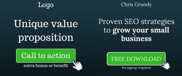
- One banner – one message. Do not turn an ad into a “sheet” of text. This is not a newspaper article. To attract a client, one attempt.
- If you need to highlight several advantages, add an animation based on the carousel principle, where phrases are shown alternately. But do not overdo it, only a few users wait longer than three or four seconds;
- Logic – the wording should be clear and logical. If there is a question , there must be an answer. And you need to invest in 5-10 words.
- A banner is a completed work. Make sure that there are: a title, a complete sentence (UTP), a call to action with a button. If you are promoting your own brand, a logo is required;
- The simpler the better – there is not much space on the banner, but it should not be taken up to the maximum. Bulky designs, an abundance of bright buttons, flashing elements – this is annoying and has nothing to do with trust, reliability;
- Experiment with the design. Create two, three, four banner design options and test them. According to the results of trial runs, leave the most conversion rate. Some grids have the option A/B testing – parallel display of different creatives. Use it;
- Animation – perfectly attracts the eye. This happens on a subconscious level. If a person sees even a small movement on a static page, he will definitely look at it. It is easier to create a static banner, but after spending 15 minutes adding animated elements, the conversion can be increased three or four times. Don’t overdo it: a moving logo or a “carousel” of two or three advantages will be enough;
- Instead of a graphic banner – a video. It is relevant for mobile advertising, social networks, pop-up, some ordinary grids also accept this format (you can make a video even for a “billboard” or “skyscraper”). It’s not as difficult as it seems, it takes almost as much time as animation (html5). It is enough to find a video phone (there are free ones on YouTube, Shutterstock), place several animated text calls;
- It’s better to be good than original. Creative, unusual text with humor, playing sex can work, but if you are not sure , we take proven solutions: we look at the samples of competitors, use them as a basis. Large companies have invested a lot of money and such advertising definitely works well. But spend a few minutes looking at different options, do not take the first one that came along, which was quickly made up by another arbitrageur;
- The topic of sex works, but not always. (Of course, if you’re not planning to work with adalt-offers, this topic just needs erotic photos). It works better for a young audience (up to 25 years old). Due to its active use in the promotion of dubious services, including by scammers, erotic images can cause the opposite effect in an audience of 30+ and even push away from a good product. Alternative approach: humor, funny images.
When developing a display ad, you need to choose the right size. Firstly, these are the requirements of advertising platforms, the formats are universal, the sites have clearly allocated areas. There are leaderboards, semi-banners, portrait, billboards, half-page. This is only a part of desktop formats. There is also mobile advertising, social networks have their own requirements – advertising by the size of posts. The second reason is efficiency. It directly depends on the position-consider the size. Below is a small guide that will help you understand all the variety of sizes.
The sizes of banners for contextual advertising of Google Ads, Bing Ads, Yahoo Gemini, most teaser and banner networks are the same. For some sites, the choice of sizes is reduced to 4-6, some sizes differ by several pixels. Or ads are displayed in a compressed size. For example, 640×960 px is displayed in the YAN as 320×480 px.
Teasers use a moving “carousel” of small blocks with sides from 50×50 pixels to 150×150. Although the sizes of the “carousels” themselves are unified with banner advertising.
Now about efficiency. First of all, clickability. Even if you pay not for impressions, but for clicks, what is the point of running ads that no one clicks on with thousands of views.
Ads embedded in the text (native ads) work better. On average, they give the arbam of the LeadBit partner network up to 40% of conversions. Leaderboards have about 25-27%. “Half-page” 300×600 in the column on the left and right give 10% of conversions each. A similar indicator is for “skyscrapers” (160×600). Ads in the basement of the site work worse – often users do not reach them.
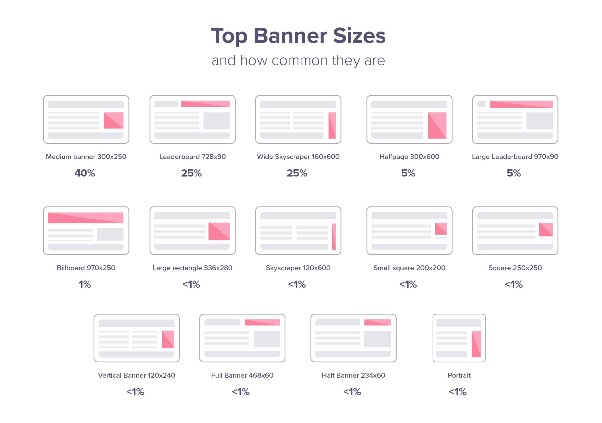
Standard banner formats and recommended file size:
| Size (Px) | Name | Global Frequency | Weight | Example |
| 300×250 | Medium Rectangle | 40% | < 150kb |  |
| 728×90 | Leaderboard | 25% | < 150kb |  |
| 160×600 | Wide Skyscraper | 12% | < 150kb |  |
| 300×600 | Half Page | 5% | < 150kb | 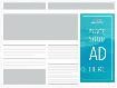 |
| 970×250 | Billboard | 1% | < 150kb | 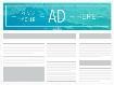 |
| 336×280 | Large Rectangle | <1% | < 150kb |  |
| 468×60 | Banner | <1% | < 150kb |  |
| 234×60 | Half Banner | <1% | < 150kb |  |
| 120×600 | Skyscraper | <1% | < 150kb |  |
| 120×240 | Vertical Banner | <1% | < 150kb |  |
| 300×1050 | Portrait | <1% | < 150kb |  |
| 970×90 | Large Leaderboard | <1% | < 150kb |  |
| 250×250 | Square | <1% | < 150kb |  |
| 200×200 | Small Square | <1% | < 150kb |  |
| 180×150 | Small Rectangle | <1% | < 150kb |  |
| 125×125 | Button | <1% | < 150kb |
There are many advertising formats, but not all webmasters allocate space on the site. The most common “Medium banners” are 300×250 pixels (40%) and 728×90 leaderboards (25%). Vertical formats are rarely used (about 1%). By launching an advertising campaign with creatives of this size, you can easily lose a significant audience of popular entertainment and news portals. To learn more about the common ad sizes, including for individual countries, you can read in the Google Ads Guide and more here.
In addition to the physical size, it is important to take into account the “weight” of the file. For most traffic exchanges, this is no more than 150 kB. Accepted formats: Gif (some grids show only the first frame), Jpeg, PNG, HTML5. We focus on the last two: PNG for static and HTML5 for dynamic with active buttons. They are compatible with any advertising networks, allow you to compress a file without compromising quality.
Mobile advertising
Unfortunately, you will have to make banners separately for mobile advertising. Great news – there are only five common sizes. The only popular one is the mobile leaderboard (320х50).
Mobile Banner Sizes:
| Size (Px) | Name | Global Frequency | Weight | Example |
| 320×50 | Mobile Leaderboard | 12% | < 150kb | 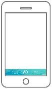 |
| 320×320 | Mobile Full Page Flex | 1% | <150kb |  |
| 320×100 | Large Mobile Banner | <1% | < 150kb |  |
| 250×250 | Square | <1% | < 150kb |  |
| 200×200 | Small Square | <1% | < 150kb |  |
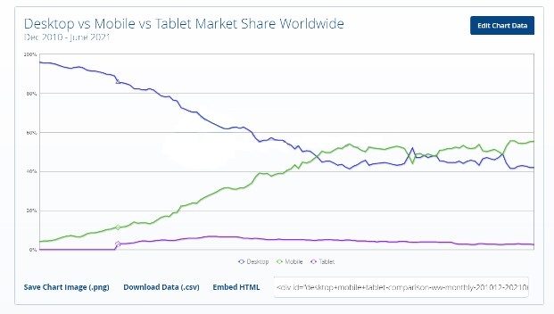
Although mobile advertising occupies only about 15% of the market, ignoring it is like death. According to the results of Statcounter, since 2016, mobile traffic has overtaken desktop traffic and ranges within 55% (according to match2one.com – about 63%). So far, these are specific requests related to calling a taxi, traveling, searching for cafes, tickets. And surfing in social networks. Most people prefer to search for products, make long-term plans from computers.
But now the smartphone screen allows you to comfortably view even full-size desktop sites without switching to the mobile version. Most portals have switched to adaptive layout. Analysts expect a noticeable increase in mobile advertising volumes in the next year or two.
Social network
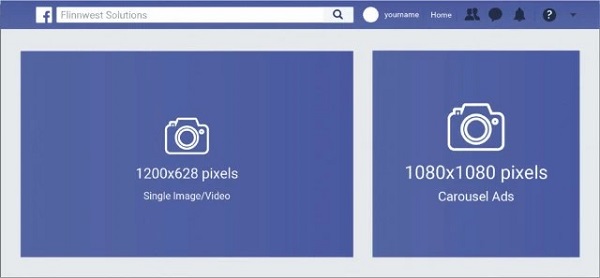
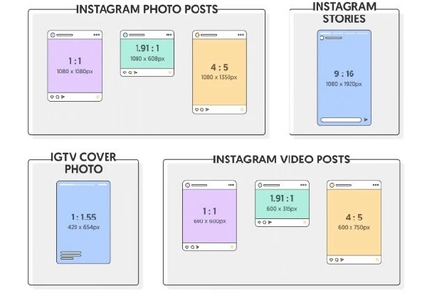
How can we do without Facebook, Instagram and other social networks? Advertising gives an incredible conversion rate here, even in comparison with the context. But the requirements are also more stringent. Although… there are not many sizes here, it’s easy to develop banners. They are mainly used 1200×628 px for native advertising. 1080 x 1080 for “carousel”.
Other social media sites have similar sizes: VK.com, Twitter. Vkontakte additionally uses teasers (537×240, 145×165). Instagram has more banner formats: 1080×1080, 1080×608, 1080×1350, etc. But let’s be honest, and the approaches here are slightly different. How to create an advertising post for Instagram – a topic for a separate article.
Now to the point. We know in theory what a banner should be, we learned what kind of software is needed. But what about in practice? A small step-by-step guide:
Select a tool
Even if you copy and adapt other people’s banners, you can’t do without a graphic editor. What is better to use?
Do you think I’ll start the list with Photoshop? You didn’t guess right. Large web studios use a package of applications at once, like Adobe’s Creative Cloud or Corel’s Graphics Suite. But if there is no task to develop a brandbook concept from scratch, you just need to prepare a creative based on ready-made promotional materials, you can use simpler software, sharpened for the development of banners.
Easier to learn online services: madgicx.com, crello.com, bannerboo.com, creatopy.com. The interface and capabilities are similar. Visual constructors drag and drop – no programming. The animation is easily customizable. Ready-made template library. Canvas has a little less options for setting up animation, but it is as simple as a board. And a bonus – convenient preparation of video ads for YouTube, mobile advertising.
Are you planning to create complex banners? Do you want to automate the process, work with the source code and edit other people’s banners in a few clicks? It is worth mastering Google Web Designer.
A simple and FREE program allows you to prepare advertising creos for any platform, from smartphones to Smart TV, in a few clicks. The design is similar to the software for working with graphics from Adobe (Illustrator, Photoshop, DreamWeaver). But there is nothing superfluous here, just what you need to work with advertising creatives. It is not difficult for a beginner to master the application. Thanks to the ready-made templates, you do not need to deal with the dimensions. We choose one of the options and work with the design. After the campaign is launched, all ad elements are guaranteed to be clearly visible, without cropping.
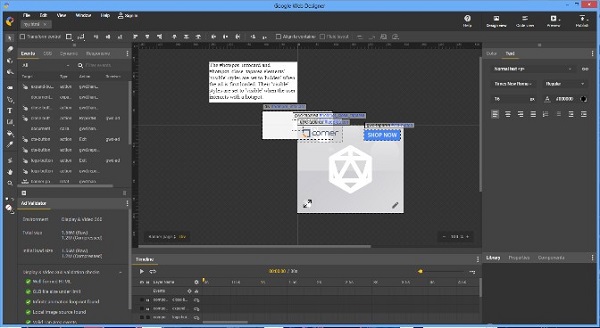
Plus – there is a built-in HTML5 editor. It is convenient to develop an interactive “motion graphics” with active buttons. The application does not take a lot of resources, it works even on weak laptops.
The alternative is Adobe Animate. The advantage of this program is convenient export/import from other Adobe applications.
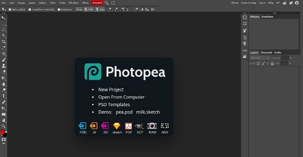
You can’t do without a graphic and raster editor – you will have to crop pictures, draw simple illustrations, apply effects. In GWD, this is not so convenient and fast. The best software is a package from Adobe (Photoshop and Illustrator) or Corel (Photo-Paint, CorelDRAW). But for most, the possibilities of free analogues are enough: GIMP, Photopea, Photo Pos Pro.
According to the capabilities of the online editor photopea.com minimally inferior to Photoshop: supports pdf, psd files, works with layers, filters, masks there is a similar set of tools for drawing.
When choosing software, there is a simple rule: if you are used to working with some program, for example, you have studied Photoshop, you should not be wise. Use what you know well. The result depends not on the application, but on you. Even in Paint, you can create a cool banner.
Study your audience
To make a banner, it is important to understand how the audience behaves and where it is located. Banners for advertising in social networks and through contextual advertising are different. But there are other factors: traditions, culture, habits. It is important to study in advance what associations a particular color causes in customers. What is important for the audience?
If these are products for children or for young mothers, soft colors (soft pink, peach), the image of the child will increase the clickability.
When promoting dating sites (dating), it is important to remember that the main target audience of marriage agencies is men over 30-35 years old. They are looking for a bride – a companion for life. Therefore, reliability and trust come first. Erotic photos cause incorrect associations, the opposite effect is possible.
If you are promoting an online casino – it is not always relevant to use greed. In Tier 1 regions, the emphasis on the opportunity to get rich may subconsciously offend the client – as if the advertising hints that he is unsuccessful, a beggar. Promoting roulette or slot machines in Germany, Italy, the USA, Canada, Belgium, the emphasis is on reliability, security, a large selection of slot machines, legality, certification.
Where can I get information? It is not necessary to order marketing research. Everything is available in open sources. First, we throw a portrait using the 5W method of Mark Sherrington. Ask five questions and try to answer them:
- What — What? What product are we selling;
- Who — To whom? Who is our target audience: age, social status, wealth;
- Where — Where? Where is it located, in what circumstances;
- When — When? What conditions are needed for the purchase;
- Why — What for? Need – Use.
The answers that you will give are just a theory. Now you need to confirm or deny it. There are several ways. We use analytics services to find keywords, geography: wordstat.yandex.ru, Google Trends, Google keyword planner. We use statistics services (a lot of data can be obtained in the public domain): statista, statcounter, worldometr, similarweb, globalstat.eu, alexa. You can also study thematic forums or groups in social networks to see your target audience, her hobbies.
Develop a concept
You don’t have to start with development right away. Throw the layout by hand on a sheet of paper or make it in the program.
Even if you have a dozen ready-made ideas, look at the competitors. Large companies invest thousands of dollars in the development of advertising and launch banners that give the largest influx of customers.
Where to get ideas? The easiest way is to search in a search engine, for example “cellulite cream banner”. Google will give you dozens of examples. You can use pinterest instead of Google. But keep in mind, many creatives have worked out the audience. The best way to find the most relevant creatives is Spy services.
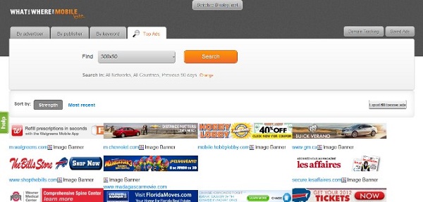
These are special platforms that track advertising campaigns (launch bots) and show current creatives. It’s easy to use. There is an exact search: GEO, keywords, device type, OS, browser, age, gender. There are both paid and free sites.
Popular SPY Tools: AdMobiSpy, Publer, AdvanceTS, ADLover, AdPlexity, SEMrush, SpyOver, Magicadz.co, WhatRunsWhere, Anstrex.com. More of the best SPYs are in our review. Separately, you can read about SPY services for Facebook.
The first stage is to collect and prepare pictures, logos, illustrations. You can find backgrounds and footages on photo banks. There are free ones, it is not necessary to spend money. Crop images, make color correction, it is more convenient in graphic editors (Photoshop or any free one). It is also easier to refine vector graphics here.
Although there are tools for processing graphics in Adobe Animate and Google Web Designer, they are not very convenient. Even cropping the photo will take longer. This software is focused on the development of animation – you can assemble a banner, adjust the effects in a few minutes.
It all comes down to four operations: choose a template/size, add illustrations by dragging or opening from a folder, insert elements, configure effects. That’s it! Exporting the creative to the desired format.
Save banners correctly! For static images – PNG, in extreme cases Jpeg. For animation – HTML5. Do not use GIF (some grids show only the first frame) and outdated Flash, it is no longer supported.
Soft
Tools that you will need:
- Software for banner development and animation: Google Web Designer, Adobe Animate;
- alternative – online services: creatopy.com, madgicx.com, crello.com, bannerboo.com, piktochart.com, animatron.com.
- paid editors of vector and raster graphics: CorelDraw, Corel Photo-Paint, Photoshop, Illustrator, Pixelmator, Sketch, Affinity Photo;
- free analogs: GIMP, Photo Pos Pro, Photoshop Express, Choco Flop (for Mac), Pixia, paint.net;
- free online editors: Pixlr.com, Photopea.com, Sumopaint;
- publishing platform canva.com – the functionality is similar to MS Microsoft Publisher. Allows you to create a design of banners, ads for Instagram, video ads for YouTube. Contains a set of templates, images, illustrations, photos;
- photo bank with photos, footages, illustrations: shutterstock.com, pexels.com, pickupimage.com, freeimages.com, pixabay.com, freerangestock.com, library YouTube, Adobe Stock, Depositphotos;
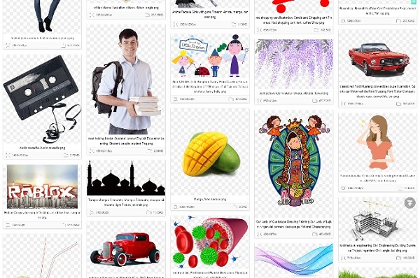
- bank of footages and illustrations pngegg.com.
FAQ
It all depends on the promotion model: through social networks, mobile or banner advertising. About 90% of customers bring such formats:
- 300×250 – Medium Rectangle;
- 728×90 – Leaderboard;
- 160×600 – Wide Skyscraper;
- 300×600 – Half Page;
- 320×50 – Mobile Leaderboard.