

Not sure if it is worth making a separate mobile landing page and whether you need one in your affiliate marketing chain? Have you decided to give mobile landing pages a try and want to do well right away so as not to waste a large budget on tests?
One thing’s for sure – mobile landing pages are no longer something unusual. It has become a regular marketing tool, like contextual ads. But Google Analytics statistics show that many companies neglect the mobile audience. Best case scenario – they make the desktop landing page version adaptable to mobile screens. Worst case – mobile users get ignored entirely. What can this lead to?
That’s right, to pushing the audience away. Can it get even worse? Yes! A bad landing page which is just a refolded desktop version. Such pages push users away even harder.
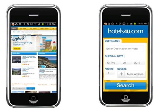
You can simply ignore the mobile audience and just focus on desktop users the old fashioned way. But is it wise giving up such a big slice of the pie? If you are considering mastering the mobile Internet segment, this digest is definitely for you. It doesn’t matter if you have been using separate landing pages for smartphones for a long time or are just starting to get acquainted with the tool, in this article you will learn many useful tips. Today we will talk about mobile landing pages and how to effectively work with your audience.
To learn how to achieve maximum conversion when creating a Landing page for desktops, read here.
Table of contents
Why do you need mobile landing pages?
Every affiliate marketer knows: a working bundle is all you can dream of. They always work, do not require lengthy tests, and allow you to get high income with minimal investment. But constantly focusing on “used” material also isn’t the best option. Technology evolves, trends change. Whereas before traffic was made up of mostly desktop users, now mobile devices have taken the lead.
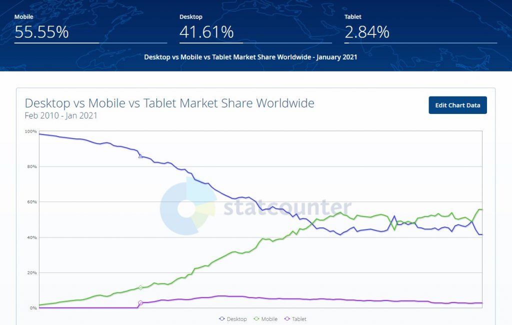
According to statistical organizations, the number of mobile and desktop Internet users equaled in 2016. By the beginning of 2021, the prevalence of portable devices has only increased and reached 58%. Меняется поведение. Behavior changes. 2-3 years ago smartphones were still used mainly for quickly finding the necessary information, checking your email or the social media feed. Now they are gradually taking over the functions of desktops.
According to Statista, in the US, about 40% of online sales are made from mobile phones. While users are buying more through their desktops in absolute terms, the gap is not that great. If we compare the number of orders, then the majority will take the side of mobile users – 53%. The difference is due to the fact that users make small purchases from smartphones: they order pizza, inexpensive clothes. Expensive products that require detailed study are ordered from desktops: TVs, laptops, etc.
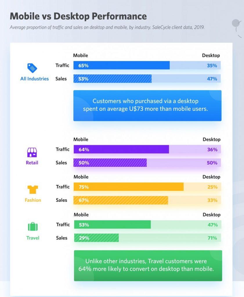
So far, in many industries, online sales are made through desktop devices. For example, travel vouchers are more often ordered through desktop PCs (as mentioned above, buyers make big purchases from desktops) – about 71%. But the situation is changing. This is reflected in marketing strategies.
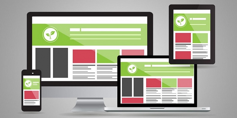
If 3-5 years ago the trend was responsive (not to be confused with adaptive) design: the base is a PC browser layout, which can adapt (stretch or shrink) to different screen formats. This approach has now become outdated. If it works in one vertical, that’s fine. You can leave it until… Don’t forget that everything is changing. Now, to get a good conversion rate you have to consider the needs of the mobile audience.
The correct strategy is to separately launch advertising campaigns aimed and desktop and mobile audiences. You can launch one campaign for both, but mobile visitors should get a unique experience. They won’t need an abundance of elements of a full-fledged interface. Just like you don’t need blocks of text that people just don’t have any time to read. The approach concerns both targeting settings and creatives. Universal funnels and banners with a now stale design have long not worked properly. Choosing such a design will lead to one of two outcomes: you lose just the mobile audience (half of potential conversions) or both markets.
What should a mobile landing page look like for it to sell?
Before we answer that question we should talk about how mobile users behave.
Take a moment to remember why you go into a browser. View the bus schedule when you are already on the way to the bus station, find the nearest gas station, quickly order pizza or just check your feed or email whilst you have time. We use a smartphone on the go to quickly find the information we need, no one is going to scroll through long pages. Whereas computers are more often suitable for detailed study. This leads to a logical conclusion – mobile landing page should be concise. What does that mean?
The mobile landing page should not contain a jumble of various blocks: text, graphics, animation. First off, minimalism is the modern choice. Second, on a small screen, all this will merge into a colorful blur – no one will zoom in to take a closer look at each separate element (except maybe the designer to admire the fruits of his labor). Don’t be afraid to leave some space blank.
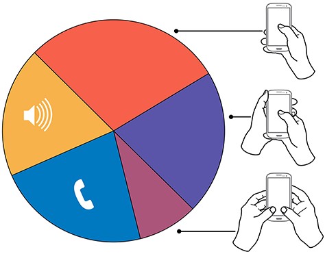
Remember, 99 out of 100 users (actually, all 100 of them) browse emails and ads with one hand. The second hand is used only for something important, like playing their favorite game. The landing page will lead to a conversion only if the use can both see the creative and perform the target action with minimal effort: they came, they saw, they subscribed.
The optimal variant: a short offer and a button or an interactive widget. You can add a small menu or give the user an option to scroll down to blocks with more detailed info. That’s it. Colorful drawings, long stories – this will make the user, at best, leave a bookmark to come back to it later. Maybe. Let’s not be naive, “later” may happen in a week, a month or… never.

Instant loading of the page
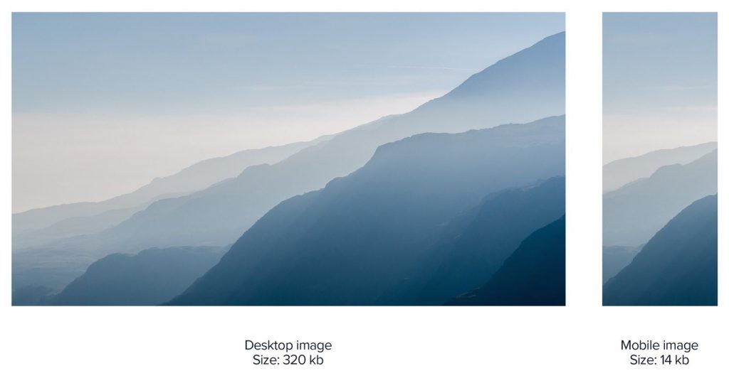
You have no more than 2 seconds to load the page and about 0.5 seconds more to engage the user. If the landing page takes longer than 3 seconds to load, you have lost 30% of the audience. If more than 5 – 50 to 90% of users will leave without even reading your offer.
How to optimize the loading time? Disable most of the available plugins, leave only the most essential ones. Don’t overuse the visuals. No video or complicated animation – see point one: concise design. Optimize the images – high resolution and large size are not needed. Simple pictures of 320, maximum 480, pixels. Even if the screen is UHD, it’s still small and the user won’t be able to tell the difference. But the size of the images will decrease and, consequently, the speed will increase.
Services such as TinyJPG or Photoshop’s “Export for Web” tool can help you choose the appropriate size. You can estimate the speed using Google PageSpeed Insights or Mobitest.
You can also clean up the code if you are familiar with HTML and CSS. But, usually, the above steps are more than enough.
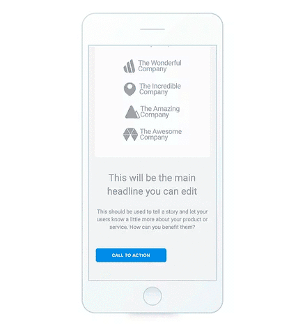
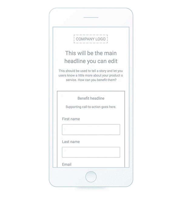
An informative headline and a short text
The best headlines are those that direct a user to a specific action. They should interact with the reader, contain specific facts, numbers. You need to hit the ace from the first try – there won’t be a second one.
The text should match the title and convey the essence of the offer while not piling up useless words. Superlative adjective forms (best, perfect) don’t work but sure take up a lot of space. No one will take your word for it, nor will they go to check whether this is true (if they do, they are unlikely to return).
The perfect text responds to the client’s potential desires or insecurities: how the product or service will improve their life. Below it place a couple of facts to prove your point. Use bulleted lists – if you need to highlight important points.
A one column layout
Mobile devices have vertical screens. Naturally, no mobile user wants to scroll through and between several columns of content, like they could do on their PC. To make you webpages easy to navigate spend some time on designing the correct layout.
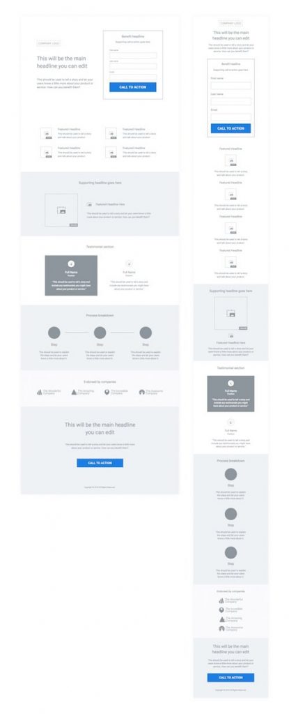
Spread all your information throughout several blocks. The main screen is a USP with a call to action. To make it easier to see the details, add a scroll button or a sandwich menu (a button with three horizontal stripes).
When directed to a mobile landing page, a potential client wants to quickly get information: what is the offer, why do I need it, what do I need to do. No one likes to flip through tonnes of info for a long time. So, your job is to make it clear what you need the client to do in the visible part of the first page they see. This also includes the action button (CTA). If you put it on the second screen, the conversion rate will drop by 30-35%. If it’s on the first page but somewhere in the bottom part, you’ll get only 25% of the potential conversions.
The CTA button should solve the visitor’s problem with them needing to perform the least possible number of steps. So, if it’s a phone number, it has to be clickable. If it’s a redirect to the website of an affiliate program, then it needs to lead directly to the product the landing page promotes or to a registration form if it’s a dating, gambling or financial affiliate program.
Optimized lead forms
Even PC users don’t like to fill out long forms. And filling out such forms on mobile devices is an absolute nightmare. Ask yourself, do you really need all this info? If you’re a marketer, a phone number and name are enough in most cases. If the landing page is for affiliate marketing, you only need an email address.
If you need to get more data about the client, optimize the form: let them put their First and Last name in one field, break down the process of filling out the form into 2-3 stages. Compress the space between the fields so that the client does not have to scroll to the next line.
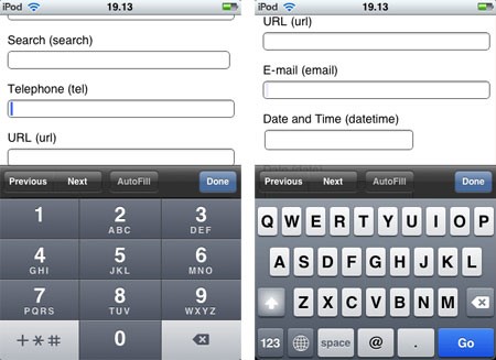
For convenience, attach a virtual keyboard to the form. If you know HTML, you can insert a line like <input type=”tel”/> or <input type=”email”/>. If it’s a phone number you’re after, bring up the numpad keyboard – don’t make the user switch to it on their own.
How to make a mobile landing page?
We won’t go too deep into the stages of creating a mobile landing page. The principles are the same as when creating desktop landing pages:
- study the audience: it’s insecurities and desires. Knowing a potential buyer inside and out is your bread and butter;
- study the behavior of the potential audience, mainly the way they use their mobile gadgets;
- prepare the USP – your landing page will be built around it;
- create the structure – it’s easier to do it for mobile landing pages than traditional ones. It is important to know: how many screens there will be, will the client need to scroll or navigate menus;
- make a prototype: decide where to place the elements. Take into account visual perception, how user-friendly the interface is. Remember: more often users operate a smartphone with one hand;
- write the text – only the essentials, but that doesn’t really make the task any easier, you need to succinctly describe the idea in several sentences;
- design – a technical part. You can order it even. But a good affiliate marketer should be able to do everything themself, this also saves funds and time, given that you have to launch hundreds of campaigns.
Mobile design and what you need to know about it
Now to the fun part – something that you won’t find in other articles about mobile landing page creation. How to make a landing page?
There are many examples of cool landing pages online. But how do you make one as good yourself, what should you pay attention too? Watching good examples does not equal learning to make ones on your own. Taking a ready-made template and using it for your campaign also isn’t the best option. Create the design taking into account the vertical. Here are some secrets and practical tips to help you create a mobile landing page with a cool design.
Take into account the user’s experience of interacting with it
Remember, the diagonal of most smartphones is from 5.5 to 6.5 inches. Although the screen size is significantly larger compared to 2000s phones, it’s still rather small, which makes it hard to see smaller elements. So, pick simple images. It’s better to not use large-format pictures – they contain a lot of details that are difficult to make out.
People often use their smartphones outside. Contrasting images are easier to make out when the sun is shining right on the screen. They also look stylish, harmonize well with the laconic design.
A design the user can “touch”
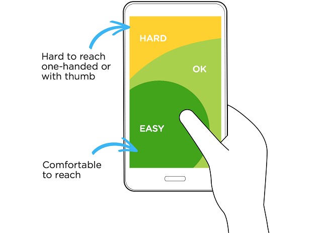
Let me recap our main point – users control the smartphone mainly with one hand. The design should enable the user to get to the desired action as quickly as possible. Here’s how you do that:
- make the buttons and fields of such a size so that it is easy to press them with a finger or read them without zooming in;
- no unnecessary elements that react to accidental touches – leave an empty space (remember – simple design);
- place buttons in places where it’s easy to press them: put the Call to Action button in the lower third of the screen, below it place the scroll button.
What does this all mean in practice? If on desktop funnels, the location of each layout element is thought out separately, then for mobile ones they are all grouped together. Our goal is to simplify the task for the client so that they won’t need to scroll a lot between perceiving the information and performing the desired action.
All links and CTA buttons should be easy to click. The optimal height is 40 to 70 pixels. Better to have it closer to 70 (Apple recommends 57 ppi – the width of a finger). Don’t be afraid to make them as wide as the column – that way the elements will appear more clickable. But not as wide as the page, so that the user does not mistake them for a separate block.
Leave margins on the sides – about 20 pixels. 20 to 40 pixels of space between blocks or elements. This is a buffer zone that makes scrolling easier, improves perception of elements.
The text must be readable
This point seems obvious. But every day I come across dozens of landing pages where I have to squint to even understand what is written on it. Small text against a way too colorful background… The only thing worse is an ornate font which on most smartphones looks like a jumble of incoherent squares.
Choose standard fonts that are supported on any device: Arial, PT Sans, Sans Serif, Serif, Courier, Open Sans. If you have any doubts, take fonts from Google’s open library. You can choose between laconic, uppercase and elegant serif fonts without the risk of making your text unreadable.
With the help of fonts you are able to convey the message of your landing page. For example, laconic Sans Serif will emphasize modernity, while Serif will add elegance.
The text should be in contrast to the background. The main heading is 28 pixels, the first subheading is 22 pp, and the normal text is 17 pp. For other details – 15 pp. This is just an example, you can mess around with the sizes. The main rule is that the text must be readable.
Playing around with design – a non-standard approach always works
I already mentioned this in my post about desktop landing pages, but I’ll say it again – there is no ideal landing page format. Interests change, new approaches appear. Therefore, play around with the design, do some A/B testing.
In case someone doesn’t know, A/B testing is the simultaneous launch of several variants of the landing page in order to evaluate how users react to each one. After the test, you can choose the option with the highest conversion rate and use only it.
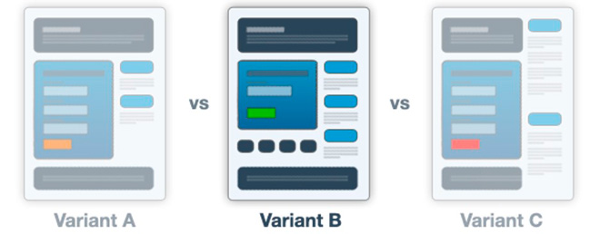
Many online builders and specialized trackers have the A/B test option. Create several design options, open the tool and add addresses, attach the resulting link to a redirect from a banner or teaser. The system will do the rest.
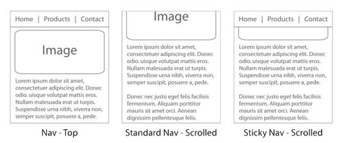
For example, the Call To Action button can be moved from the main screen to the second page, but don’t hide it so the user could find it quickly. The menu or the CTA button can be fixed on the screen (Sticky Navigation) – sticky hedgers, footers. This is one of the ways to increase the conversion rate up to 20%.
Use language that the buyer understands. Instead of “download” – get a free lecture/book/trial course now. Instead of “Send” – “Try for free”.
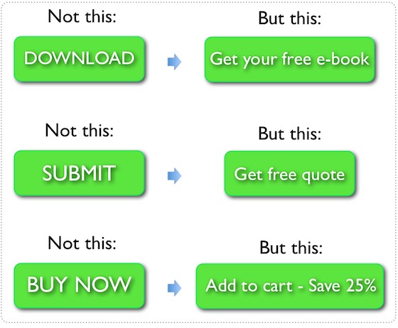
Take note, mobile users are just getting a glimpse of the information. They prefer to make purchases from a desktop PC. Don’t let them leave, there is an 80% chance that the user will not return. Hook them using discounts, gifts and other goodies. For example, instead of “Buy” put “Add to cart with a 25% discount”.
Services for creating mobile landing pages
You don’t need to code from scratch. There are dozens of visual browser builders and web development applications. But not all of them have features for creating specifically mobile landing pages. The most commonly available feature is adaptive design – which in reality is actually responsive.
You can design a landing page for mobile devices using any website builder. Most often, you have to build a page from scratch, but with enough practice this can be done in a couple of hours. There are builders with ready-made templates and a website optimization tool for a mobile format. In this case, everything will take only 15-20 minutes.
Popular online mobile landing page builders with built-in A/B testing and hosting:
- Unbounce
- LPGenerator
- Taboola
- GetResponse
- WIX
Read more about them and other constructors in our article “TOP 20+ affiliate landing page builders”
Designing mobile landing pages is just as easy as regular websites. Choose a template, launch the builder where you can drag, add or delete blocks or separate elements. Switch to mobile format (usually found in the main settings menu). Any template available in the constructor can be adapted for mobile devices.
If you host landing pages on dedicated hosting or VDS, use a visual editor: Adobe Muse CC, Adobe Dreamweaver or free WYSIWYG Web Builder, NVU, NeonHTML.
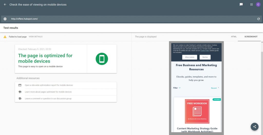
After finishing the mobile landing page’s design, I recommend checking the optimization of the site using the Mobile-friendly tool (search.google.com/test/mobile-friendly).Such pages are given priority by Google. Although this is not as important in affiliate marketing (we drive traffic to landing pages from ads), optimization increases conversion by up to 70%. You can test by URL or paste the code straight away.
To summarize: How to create a design for a mobile landing page that sells
Mobile landing pages are not a panacea; in affiliate marketing the audience’s response depends on various factors, including the ability to set up targeting and correctly compose selling bundles. But this is one tool that cannot be ignored.
How to create a landing page? It’s not difficult, web designers and visual editors make the process easy. When creating a design, remember that mobile devices are often used outside,literally on the go, and people usually operate them with just one finger. There is often no time to scroll through long feeds. Maybe a person is reading your landing page while stuck in traffic or while crossing the street. That means that brevity and concise phrases are your landing page’s best friends.
Read LeadBit review “Pre-landing pages – what are they“.