

Greetings, affiliate marketing heavyweights and rookies. In our business, the most important thing is the conversion rate. How can we increase it? How can we hook and guide a potential client to the lead with minimal investments? How can we provide the users with more info all the while keeping the creatives concise?
The banner-landing page combo is usually used to promote offers. The best creatives contain only the most necessary info: a catchy headline, capacious phrases and the key characteristics. But herein lies the problem. Since users need more information about the product/service, they go to different sites to find it and read the reviews. Later on, if they decide to purchase it, they won’t return to you but rather order it from the website where they found the missing information on. And that site just so happens to harbor an affiliate link of your competitor.

Pre-landing pages solve the above mentioned information problem. They allow you to give a detailed description, explain the correct use, benefits, even clearly demonstrate how the product/service works. All the while your creatives will remain just as concise and engaging. What is this tool and how to correctly use it? This is another digest from the Leadbit affiliate network and today you will learn some new secrets that will help you increase the conversion rate. This time we’ll take a look at pre-landing pages.
Table of contents
What is a pre-landing page and what is it for?
A pre-landing page is a sort of transit page. One of the creatives used in the promotion of goods and services on the Internet. It is used in the ad chain before the landing page and after an advertisement (banner, push-notification, other creative, Pop Up, Roll Up, etc.). We end up with an “affiliate marketing sandwich”: “ad-pre-landing page-landing page”.
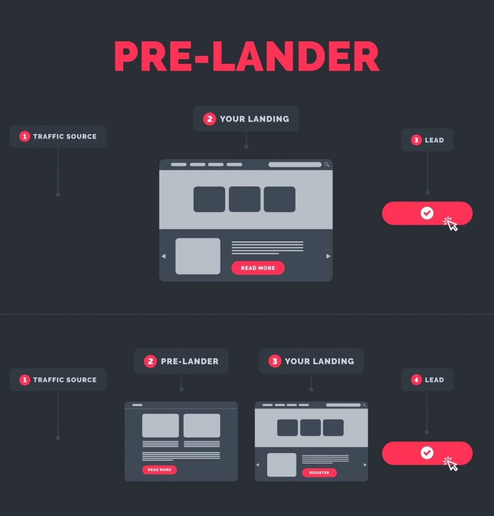
Pre-landings, like landings, consist of one or two pages (sometimes more). Their main task is to interest, arouse curiosity, provide additional information. Despite the fact that many webmasters neglect pre-landing pages, they remain an effective tool for warming up a potential audience.
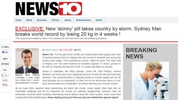
Pre-landing pages are usually disguised as news articles or blogs. Most often these are success stories, how one dude purchased this “miracle product/course”, registered on a secret website and now lives in the Maldives/Hawaii/Florida, drives a BMW/Porsche/Cadillac (underline as necessary) and in general his life is hunky-dory”. But there are other options as well.
Types of pre-landing pages:
- a pre-landing in the form of a forum or portals like “Mail.RU answers”, where members recommend a product, website, service;
- an article from an expert on an established and well-known site followed by the author’s comments;
- mini-games when promoting online casinos, binary options. Can be in the form of a wheel of fortune or an interface of a trading platform;
- a before/after article, this isn’t necessarily weight loss, you can promote anything, for example, forex or casinos: he used to be poor, worked for the man, now he’s driving a Lamborghini and own several factories in China;
- price comparison web scraping tools, showcase sites;
- an interview with an expert or a celebrity, usually the pre-landing is disguised as a news site;
- a questionnaire site, where the user must complete a small survey, after which he will be offered a service, such as a loan;
- scare tactics – shocking articles that develop whatever topic the teaser that lead to it contained. For example, There has been a spike of “…” in your city/country, this product will help prevent disease ”, etc.;
- text or video feedback from one of the customers, a review of a product or online service;
- a personal story in the form of a blog, success stories, etc.
Pre-landing pages have a specific structure. It doesn’t matter whether you’re promoting fishing gear, online casinos, or diet pills. It makes no difference whether it’s a success story, an interview with an expert or a TV celebrity. The pre-landing page text consists of the following parts:
- problem (I tried everything – nothing helped);
- solution to the problem – I accidentally came across this amazing product;
- benefits – now everything is fine (the fish jumps on the hook on its own, the kilograms are melting before my eyes, the secret method helped to get rich off of slot machines);
- the result – caught a bunch of fish, won the competition and became fabulously rich, popular, lost weight, won a beauty contest, live in Hollywood;
- reviews from other buyers who have tried the product and can confirm all of the above
With showcases, aggregator sites, it’s a little easier. In this case, find some offers promoting the same (or similar) product/service you are and highlight your affiliate program as the cheapest, most convenient one. You can place several of your offers at once: the user gets an illusion of choice, and you, regardless of their decision, get a conversion.
Naturally, the scheme I described above was a simplified one. Nowadays users, from teenagers to old ladies, have become savvy, they easily detect deception, they just do not fall for the promise of mountains of treasure. Therefore, when writing an article, carefully think over every detail so that the text does not look like an outright scam. Describe real strengths, make up believable stories.
Why do you need a pre-landing page? What does it give you?
There is a whole caste of affiliate marketers who dislike pre-landing pages and refuse to use them in their work. Their logic is as follows: a pre-landing page is an extra link in the chain that just complicates the promotion structure. Users have long figured out fake “success stories”, when they see them, they immediately leave the page. It takes more time to develop a creative, you have to invest more money.
Yeah well, nobody said it was going to be easy. But this is one side of the coin, each instrument has its own advantages and disadvantages. Low return rates are associated with a lack of experience, the use of low-quality, hastily laid out creatives.
The statistics of successful traffic managers and publishers show that pre-landing pages, depending on the vertical, increase conversion from 30 to 150%. Webmasters that work with teaser networks get the best conversion boosts – 300-500%. Why do pre-landing pages have such an effect, how does it work? The main tasks and advantages of the tool:
Informing and warming up the audience
The main task of banners, teasers, pop-ups is to hook the user. They contain a minimum of information about the offer. The landing page should be up to the task, but it’s not always possible to provide all the details on it. The purpose of the landing page is to sell the product. If the text is overloaded with details, it will no longer be attractive for the buyer.
Yes, some potential visitors have already searched for the product, so they will perform the target action. But usually the buyer needs more details: what does the service provide, how to use it, what will the
result look like? Potential customers will leave the landing page to look for additional info on forums and to google reviews. The main danger here is that they are more likely to end up on the offer of another affiliate marketer and click on their link, instead of coming back to your landing page.
Pre-landing pages are best suited to engage your audience and give them more raw data. Here you can describe the product in detail, talk about the benefits of its use, provide user reviews, work out objections. Or intrigue the audience with an unusual story.
Bypassing ad networks restrictions when promoting gray-hat affiliate programs
Large ad networks, for example Google Ads, Facebook Ads, block the ads of shady offers. This includes replicas of popular products from well-known brands (replica shoes, watches, bags, knives), gray-hat weight loss, penis enlargement or anti-hair loss products. Promoting dating offers and online casinos is also problematic. If you disguise your pre-landing as a review page, the chances of your creative getting through moderation increase.
Going through the TA, weeding out the non-target leads
Pre-landing pages provide more information about the product. The user can deem it as something they don’t need and leave the page. So what’s the point? We get rid of unwanted leads and increase the KPI. For many affiliate networks, this is a critical indicator, if it falls below a certain level, payments will be suspended.

We can go through the target audience better. Unlike generic landing pages, pre-landing pages are different. For nutra these are before/after stories. For offers that sell physical goods – a celebrity review of the product. For gambling offers – stories of successful gamblers who have learned a secret strategy, or a mini-game that stirs up interest and a sense of excitement.
Pre-landing pages allow you to accurately influence the target audience, taking into account its age, level of wealth and interests.
What else do I need to consider?
Just in case, let’s cover this point – a pre-landing page is NOT an alternative to a landing page. These two tools work in tandem. Although sometimes you can opt out of the pre-landing page and immediately redirect the user to the landing page of the offer.
Are there any cons? There are. A hastily assembled pre-landing page will only alienate the user. This is especially critical when promoting white-hat offers and expensive niches, such as the services of construction or legal companies. Low-quality (sometimes even well-designed) pre-landing pages raise doubts about the offer’s reputation.
A pre-landing page means additional financial investments. You need a domain, hosting, funds for the page’s development. It increases the distance from showing an ad to converting a user to a lead. This sometimes leads to lower profitability. But if used correctly, the pre-landing increases conversion allowing you to work with offers with high KPI requirements.
Read our article “Most profitable niche for affiliate marketing“.
When are pre-landing pages most effective?
Pre-landing pages are most relevant when promoting shock content, gambling offers, forex brokers, dating sites. They work great in conjunction with pop-up ads and teaser networks. They work great when promoting white-hat offers too, both that sell goods and services. You can use a high-quality product review with real comments as a pre-landing page (sites like Otzovik or video reviews on YouTube or other video hosting sites). Then you can place affiliate links that lead to the offer itself in the review or comments section.
Use a similar method when promoting online services (comparing banks, booking hotels, air tickets). First, direct the traffic to a high-quality review from which you can lead users to the promoted website.
When shouldn’t I use pre-landing pages?
A pre-landing page only complicates things if the audience is already warmed up and ready to buy whatever you’re promoting (steps 4 and 5 of Ben Hunt’s ladder). For example, when you buy traffic through contextual or search engine ads. Here, a pre-landing page can delay the moment of the customer making a decision (purchase), thereby potentially decreasing the conversion.
It’s best to forgo pre-landing pages when promoting expensive niches: premium goods (watches, accessories, brand clothes, expensive furniture), real estate services, building construction, real estate rental. Here even a well-developed pre-landing page only adds to the user’s already existing doubts. Better to use a different pattern: lead magnet, email ad/newsletter, landing page.
How to create a pre-landing page: a simple guide for beginners
The main question that many novice affiliate marketers ask: should they take someone else’s pre-landing page or create one from scratch? Answer: take someone else’s but remake it practically from the ground up.
Ideal pre-landing pages don’t exist. Each creative is tailored to a specific GEO and/or audience. It pursues its specific objectives and was created according to a unique affiliate marketing strategy in mind. What works for one affiliate marketer right now will be irrelevant tomorrow. Generic content becomes stale quickly and eventually stops working entirely. So develop your structure, test it out and improve it until it can be sold.
On the other hand, writing a website from scratch is long and pointless. There are hundreds of ready-made templates, there are tools that help you copy and edit other people’s pages.
The idea is this: a pre-landing page should be original, well-designed. Where do you start? Here is a generalized step-by-step guide:
Work out the technical side
A pre-landing (just like a landing page) needs to be placed somewhere: choose a domain, hosting, configure the control system.
Pre-landing pages usually consist of one or two pages, a couple of widgets. They do not require much computational power. The source code can be written from scratch in a couple of hours. You can manage it using any CMS. So choose the one you constantly use and are already familiar with.
Newbies are more likely to start with popular online website builders. Popular examples: Wix, Tilda, UNI, Nethouse, Ucraft, Hello Site, SetUp, SimpleSite, Ukit, Site123, WordPress, etc. In most cases, you can get ready-made templates, a good image library and even hosting for free. But it is better to choose one of the paid plans (for such services, prices start from $1-2 per month) and also get a second-level domain (vashsite.com format).
For active affiliate marketers who simultaneously work with dozens of GEOs and different offers, the capabilities of such online builders are not enough. The number of pages is limited, you can encounter malfunctions, many services do not allow loading a ready-made page from a PC
So sooner or later we’re faced with the necessity of buying a hosting with the most experienced affiliate marketers renting VDS servers. The prices are on the same level as those of website builders. But the possibilities are much greater, you basically get complete freedom of action.
You’ll need to put in a lot of effort, especially at the initial stages. When renting a server, you yourself will have to deal with installing everything, setting it up, connecting the domain. Once you become experienced enough you won’t need to spend some much time and effort on website builders. You’ll be able to set up and launch new pre-landing and landing pages within 5-10 minutes. At the same time you basically have unlimited pages and connected domains. It all depends on the capacities of the services you purchase.
With paid hosting most providers allow you to connect any CMS. Here are the most convenient and inexpensive (practically free) with a large choice of plugins: WordPress, Joomla, NETCAT. There’s also 1С-UMI and Bitrix – but these are more like multi-purpose machines for Internet stores and corporate websites with paid features.
When choosing a hosting and domain, focus on the GEO. The user should be familiar with the domain zone. Choose a server closer to your potential TA since that means lower ping and faster loading.
Study the TA
This part seems simple, but in terms of effort you need to put in it surpasses even the technical setup. You need to learn how to install a server, add domains and launch websites only once, after that you do it on reflex in less than 30 minutes. However, you’re going to have to study the desires and weaknesses of your audience every time you pick a new offer or swap to a different GEO.
For example, in the CIS countries betting on sports is an actual source of income for some people. So bring the user’s attention to good odds, big limits. In the EU, Southeast Asia, the USA, this is but a type of entertainment and a way to support your favorite team. The same goes for slot machines. And that’s only the beginning.
If you think that weight loss pills are purchased by all people with obesity, and this is a safe bet, think again. Consider their feelings and worries, put yourself in their place, trace their train of thought. Why do they want to lose weight? Low self-esteem? Not enough attention from the opposite sex? Or do they want to improve their health? You need to understand what drives the buyer, what incentive serves as their trigger.
Work out the structure of the pre-landing page, create content
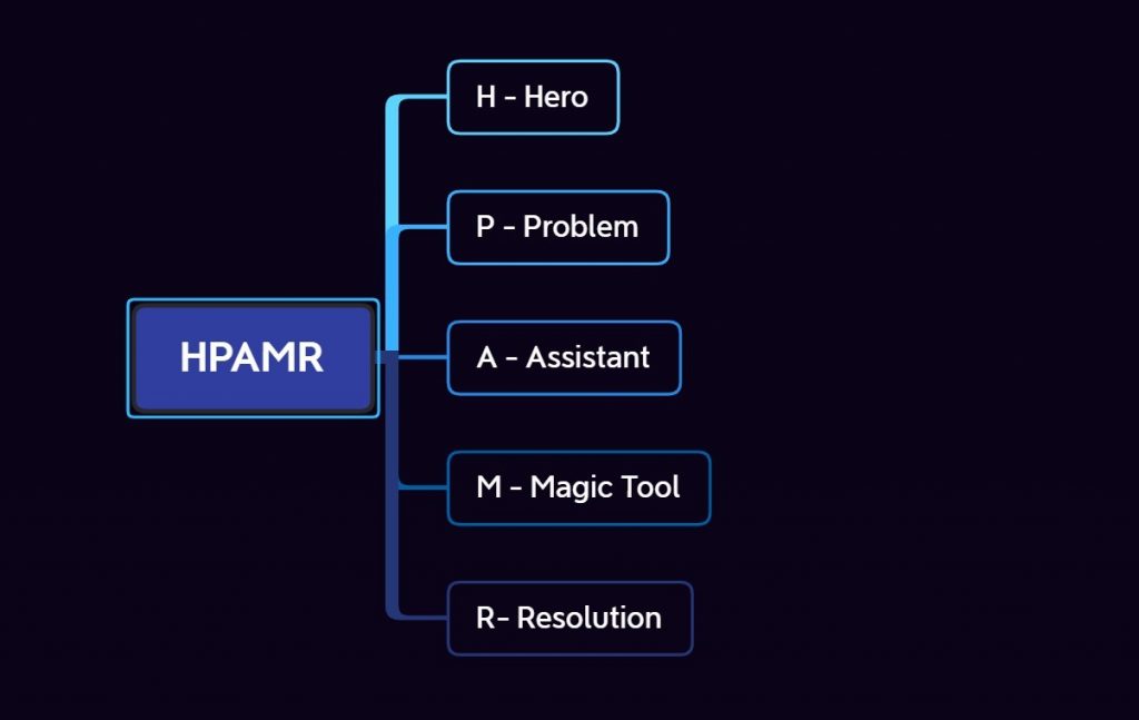
When compiling content for pre-landing pages, use the HPAMR structure. It works in 9 cases out of 10. Сompose the text according to the following plan:
- H – Hero – come up with a character, the key figure of the story. This can be a celebrity, a politician or a university student from a nearby city;
- P – Problem, the problem the hero encounter, choose one: gained too much weight, low income, joint pain, need money to pay off student loans, car, smartphone or multicooker loan;
- A – Assistant, a helping hand or even a savior. The hero’s friend, a website or famous scientist that revealed a secret;
- M – Magic Tool. The miracle working whatever, a unique strategy for making money on Forex, slot machines, betting, dating site, etc.;
- R – Resolution, the result our hero ended up with: lost weight, joints don’t hurt, got enough money to repay a loan and then some, lives in a mansion now, drives around on his yacht and lives life to its fullest.
A/B testing
Do a test launch of the pre-landing page, add the metrics, evaluate the effectiveness: click-through rate (CTR), conversion rate (CR), final KPI. During the tests, mess around with the targeting settings: display time, target audience, device type. Edit the text or layout of the creative: change the background, pictures, add or remove graphics, adjust the content. For example, swap the student for a housewife and the neighbor for a famous TV presenter.
During the test evaluate the effectiveness of different patterns. The most common are:
- banner – pre-landing page – landing page, from where we collect applications;
- banner – pre-landing page – the advertiser’s website;
- banner – pre-landing page – landing page – the advertiser’s website.
What makes a good pre-landing page?
Before launching an advertising campaign and developing a creative, it is important to know for sure: what does the ideal or at least good pre-landing page look like? There’s one answer – it needs to hook the TA and provide a good conversion rate. This depends on various factors, including the client’s mood (and sometimes even on dumb luck). Quite possibly you have seen dozens hastily laid out pre-landing pages with ridiculously delusional stories that nonetheless work!

In reality, even a low-quality ad is bound to hook someone. But such creatives would result in several times more leads (and therefore profits) if they were well thought out.
The main factors that will help increase KPI:
- loading time, the pre-landing page should load quickly, as well as redirect to the landing page in a couple of seconds. No one would wait five minutes for it to load;
- a visually appealing page. This applies to the title, images, background. A pleasant combination of colors, a minimum of colorful images, the text should be divided into blocks. No dark backgrounds under the text (unless it’s necessary to preserve the style when imitating a specific website);
- the ad should be comfortable to look at, it is better to use an adaptive page, if possible, indicate the type of device, OS, browser for correct display;
- a structured text, it should contain numbers, facts, logical arguments, everything that can evoke emotions in the user, a sense of authority and nudge the user towards performing the target action;
- the page must be alive: make sure to have user reviews, recommendations, don’t forget to update the dates;
- pre-landing pages disguised as a reputable news site or magazine have an excellent conversion rate;
- addressing the audience in first person – creates the effect of personal communication, as if the author is personally talking to the reader.
A good pre-landing page should inspire trust both with its appearance and content. If it’s disguised as a multi-page website, then you need a meno and at least 2 more pages with text. Make sure the images are high-quality and that the text is not trivial. Outright lies and fakes that are easy to verify will alienate the user, regardless of whether you are promoting a shadi semi-legal product or an actual brand.
If we cover the things that reduce user trust of the pre-landing (which is basically the equivalent of a drop in conversion), then we’ll end up with an entire list of no-nos:
- grammatical errors, clumsy phrases, illiterate expressions;
- inaccurate data that can be easily verified, blatant and obvious deception;
- bluntly and excessively praising the product, frequent use of the superlative (the most enchanting, the most fantastic, the utmost);
- overly persistent calls to action: obsessive calls to action: buy, buy, buy, which are repeated many times throughout the text. The user will get the impression that you’re shoving the product down their throat;
- the story is too unnatural, an unrealistically large price difference is indicated (a discount of 80, 90% and more looks suspicious);
- messed up, overlapping text and images, use adaptive templates, test the display on at least several popular browsers and operating systems;
- reviews and avatars that users have already seen thousands of times. Take the trouble to come up with something unique, scroll through at least several Google images pages when picking photos;
- colorful page design, white text against a dark background (black text against a blue or green, bright red, yellow sheet is even worse), flashing elements, teaser blocks, extra buttons – all this distracts the user and prompts them to close the page before they finish the text to end;
- a disrespectful attitude towards the reader: a lot of profanity, getting personal, insulting a group of people – all this will alienate the reader even if they agree with the author.
What to write about: pre-landing page text design
When writing text for pre-landing pages, remember that it’s meant to warm up the audience: get rid of non-target leads, segment the audience, convince it using facts and logic. Your main task is text that is easy to comprehend. It should be written in such a way that the reader thinks that they themself came to the conclusions about the benefits of the product, and not that these thoughts were implanted in their head by the author.
Remember to respect the person’s boundaries, don’t overdo it. It’s often the case that the texts of rookie affiliate marketers just scream “Buy….buy it…c’mon, buy it”. The reader must not get the impression that you’re shoving the product down their throat.
You need to write in such a manner that the person reading your text starts thinking the things you want him to, your article needs to slightly strike a nerve (but don’t overdo it). Use triggers – psychological techniques that involve base emotions, greed, fear, the desire to get something for free and force us to act here and now.
The most simple example – list the symptoms of a disease. Describe the most common ones, that are found in almost everyone. It can be anything from fatigue and lack of sleep to some rare fatal disease (headaches, weakness, rash, etc.). When the person reads through the list, the thought “what if I’m also at risk, I have some of these symptoms. Eh, whatever, it’s nothing serious” needs to occur in their head.
But now you describe the possible consequences. And they need to be horrifying. Basically, drive the person into a state of panic and… the article ends! What do they do? Where do they run?
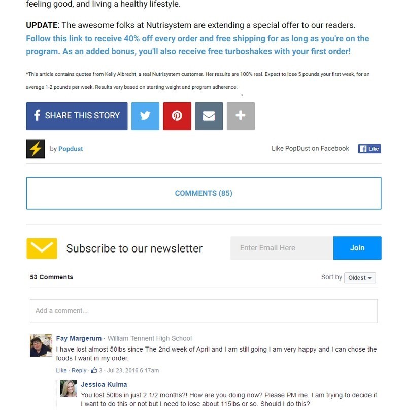
People are lazy by nature, so they will start looking for an answer on the same page. And after scrolling down they’ll find comments from other people that have encountered a similar problem. As well as the miracle-cure which will not only help make things as they were, but improve the person’s life all together. “Your brain will be rejuvenated, skin smooth as a baby’s bottom, you’ll be as fast a cheetah and win a gold medal at the Olympics”.
Comments should not only tell about the product, but also deal with any possible objections. Disputes between the participants draw attention. Someone who is dissatisfied writes that this won’t help and immediately get a dozen objections “Well, it helped ME”. The product is safe, certified, it is used by all of America, Europe, athletes and even the queen. You can buy it here. It is better to leave links in the https://blablabla.com format. Users usually leave links in this form instead of embedding them into the text.
When writing articles for pre-landing pages, place the emphasis on the TA’s weaknesses and desires. Highlight specific lines, the result should be visible. Do not put pressure on the reader, they need to want to place an order on their own.
Basic pre-landing page formats for different verticals:
Nutra
When promoting nutra offers, use popular pre-landing pages of the “Before/after” format (these will remain relevant for as long as 5-10 years). For example, an article on a popular news resource where a famous person talks about how this product helped them. This approach hits two targets simultaneously: the desire to imitate your favorite idol and confirms the reliability of the product (a celebrity will never use a dangerous, untested product).

The article can be created in the format of an interview with a doctor or a famous scientist.
Gambling
When it comes to promoting gambling offers in countries with low average incomes, success stories of players that discovered a secret strategy and now earn thousands work great. For more prosperous GEOs the text can be replaced by a free mini-game. After a couple of tries the user gets a message that they won and can get a bonus, if they register right now.

Finances
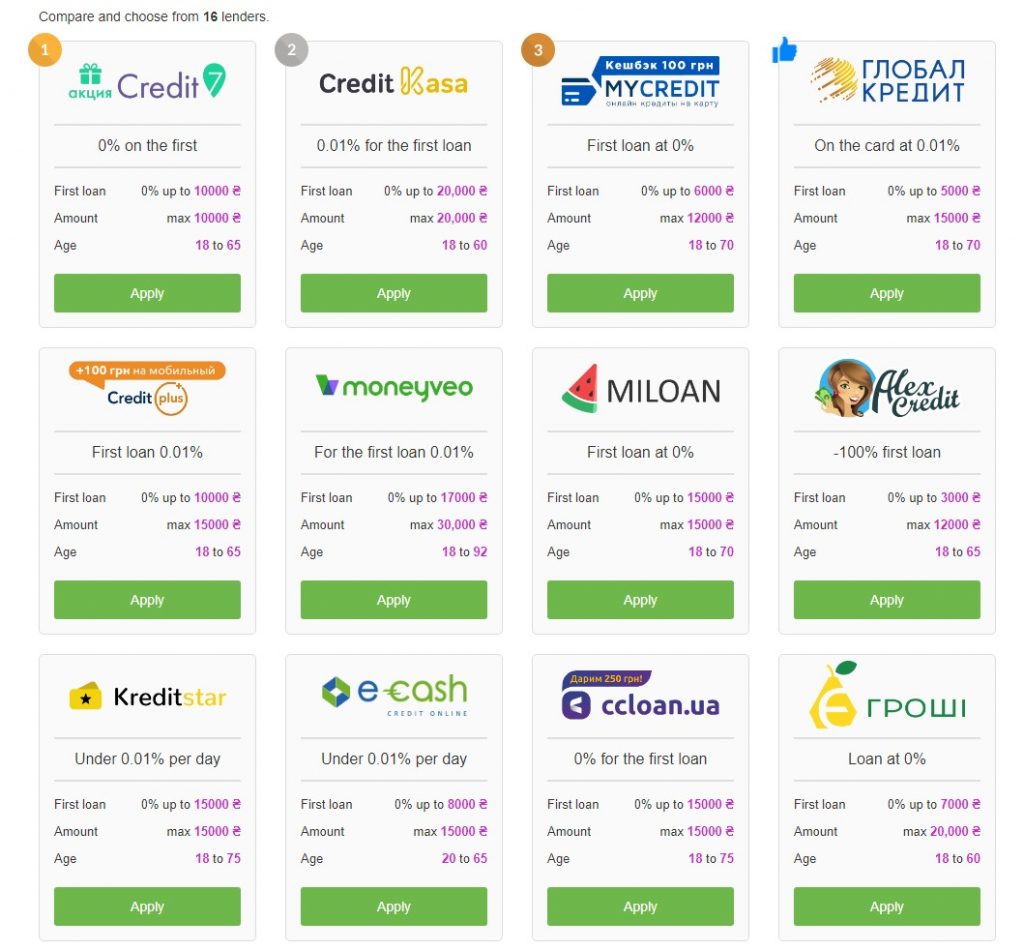
When promoting banking services or loans, use pre-landing pages in the form of a showcase with a comparison of terms and conditions. There are also the following options:
- a video review of the service on an analytical portals;
- an online calculator where you can enter your details and see the loan amount that you can apply for.
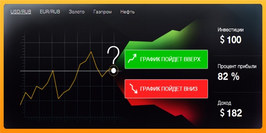
Cryptocurrencies
When promoting projects related to cryptocurrencies employ the same approaches used to promote forex brokers and binary options. Here, there are two main variants of pre-landing pages:
- the story of a player who found a successful strategy or invested in a project;
- a mini-game where the player needs to guess the direction of the cryptocurrency’s growth and place a bet.
Gaming
The main goal is to get people interested with the help of sick graphics and awesome gameplay. For demonstration, you can use screenshots, promo videos, describe the features.

Let’s sum up…
A pre-landing page is no panacea. In affiliate marketing it’s vitally important to be able to feel your potential audience and know when to act. But pre-landing pages are one of those tools that will help you increase the conversion rate and make a profit in areas where traffic was seemingly going down the drain. You need to use pre-landing pages wisely, for example, in premium verticals they can do more harm than good. But in niches where the audience is less picky, they increase profitability by several times.
FAQ
Popular examples:
- org browser extension;
- WGET utility for Windows;
- sitesucker for MacOS
- qp-copy.ru online service;
- the ScrapBook plugin for Firefox;
- Ctrl+S в Chrome.