Do you consider landing pages a lifesaver, a genuine panacea? Well, that’s because they are. Technically, you can engage in affiliate marketing without a landing page, in some verticals this can work. But if the audience isn’t warmed up, if you’ve yet to interest, convince and put the squeeze on it, a landing page is an excellent tool that increases the conversion rate by 10-15%.
Now let’s imagine a situation: the landing page has been created, money has been invested into it (and into the campaign launch). But instead of growing the conversion rate is dropping? 2 out of 3 affiliate marketers have been in this situation. The landing page isn’t selling, because it delays the moment of a person making the final decision, thereby alienating some of the potential buyers. In affiliate marketing you get a clear understanding that, a client that leaves the web page isn’t just a missed opportunity for profit – it’s a direct loss. After all, you’ve already invested time and money into attracting them and you need to somehow compensate for it.
Why does this happen? Are landing pages only for chosen ones? I won’t torment you, dear readers, let me reveal my hand: a landing page is a delicate tool. To make it work, you need to put in some effort, think over every detail. But the effort will pay off, and how. I compared the results of users of the LeadBit affiliate network. For utra, gambling and financial offers good landing pages result in an increase in leads from 30 to 300%. Only dating showed insignificant growth (though, growth nonetheless). The secret’s in the experience, says you? Perhaps, but numbers don’t lie, and experienced webmasters use landing pages not just for bleeps and giggles.
Now, onto the main course: how do you properly make a landing page? What tools to use and how to avoid mistakes? This is the topic for the CPA network Leadbit’s latest digest. Today you will learn a lot of interesting things.
Table of contents
A bit of theory: what is a landing page and why do you need one?
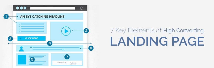
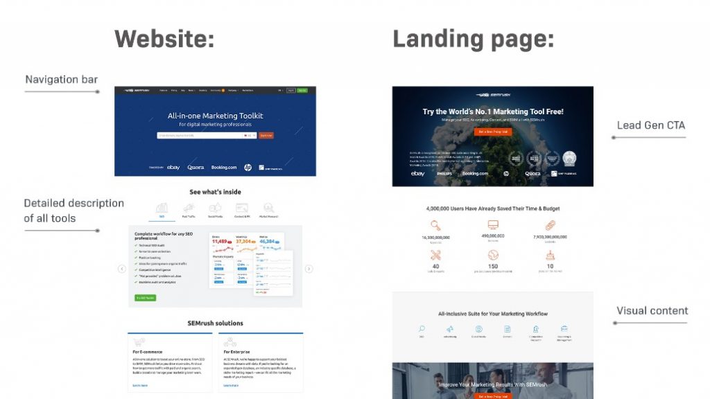
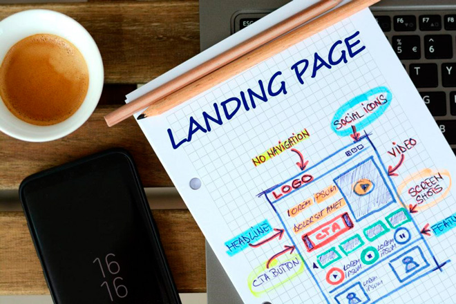
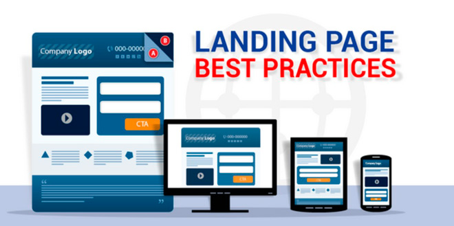
Landing and pre-landing pages (we have a separate review in our blog – “Pre-landing pages – what are they, how to use them, pros and cons“) are similar in structure. They are both an advertising website that is designed to gather an audience and encourage the user to perform a specific action. Most often consists of one page, but may include more. There are no restrictions on volume, structure is much more important:
- an attention-grabbing headline and image;
- a unique selling proposition;
- the gist: numbers, facts, advantags;
- a call to action, a feedback form, or a button to go to the target site.
The landing page can be the one the chain of creatives leads up to, or it can act as a spacer between the ad and the affiliate program’s website. But the task is always the same: to attract attention, tell about the product, convince and motivate the user to perform the necessary action. The purpose of creating landing pages is to convert web transitions into leads.
Due to the way people interact with it, landing pages are often called a trap-page or funnel. In the affiliate marketing chain, it is used immediately after an advertisement: banner, teaser, PopUnder. This allows you to tell in detail about the product, interest the buyer, talk about its benefits. It holds the user’s attention, not letting them go to another page to look for more detailed info.
Unlike regular websites, landing pages focus on one specific thing. One topic (product, service) – one action.
There are several different formats:
- showcase – a presentation of one or two products, these should be similar products, for example, several variants of boots or subtypes of the new iPhone (basic, pro, light);
- microsite – entirely dedicated to the launch of a new product or service;
- main site – such a landing page replaces the main site, a smart decision, if the company works in one direction, offers one or two services. For example, a landing page for a cleaning company or a private plumber;
- lead page (or standalone landing page) – contains a detailed advertising offer, encourages the user to take action: subscribe, make a purchase, fill out a feedback form.
Landing pages are created for a narrow audience and target specific user desires or insecurities. Not just for each offer. Even within the same vertical and one affiliate program, there can be several funnels: one for young people, the other – for the older generation, one for the housewives, the other – for the business ladies. Each landing page should solve a specific task for a specific target audience. Therefore, landing pages cannot be the same for Tier 1 and Tier 2 countries.
How to make a landing page: stages
Novice affiliate marketers and inexperienced businessmen start working on a landing page by looking at ready-made templates. But this should be your last step. It’s not that hard to make a landing page, you could get some lunch and still have plenty of time to do it before the day ends. Now the content, that’s much more important.
The landing page should not only interest, but convince the user who encountered the webpage, perhaps by accident. The funnel should hook the user and hold their attention. Every detail counts. Therefore, we start work on the funnel with the marketing, the design is the final stage.
Stages of making a landing page:
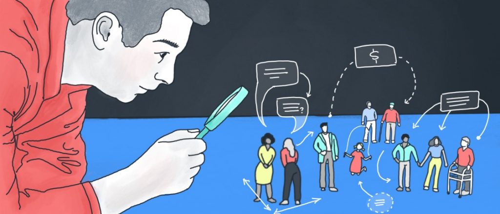
Research: identifying the target audience
Yes, you should start your landing page creation process with research. For a creative to work, it must hit the target – the problems and needs of a specific audience. You need to accurately determine your target audience, its sex, age, region. You need to understand why people buy, when and how they do it, how a service or product solves their problem.
Example: you are promoting bank cards on a portal dedicated to online games. The visitors are gamers. Who will be the target audience? Players looking for an easy way to fund their account to buy upgrades, skins, bonuses. Most players play for free. Therefore, our target audience are fans of online games who want to gain the upper hand in the virtual world. These are, for example, adults who have little time for their favorite hobby.
An alternative target audience – teenagers who have a lot of time for games, grinding for their heroes or loot. A bank card is needed to sell game accounts or artifacts and cash out the earnings.
Typically, marketing research takes days to weeks. Information can be found in thematic groups, forums. But webmasters don’t usually have this much free time. Spy services help speed up the process. They constantly monitor ads and add creatives to the general database. In a couple of clicks you can see what your competitors are currently using and what specific audience their landing pages are aimed at.

Most spy tools have several search options:
- market monitoring – just check which offers are popular and bring the most profit;
- select creatives for a specific audience. All you need to do is set the targeting settings: sex, age, device type, GEO, interests, etc.
Popular spy services for landing pages: AdPlexity, MagicAdz, AdSpy. You can search for competitors’ landing pages for free by using Google’s advanced search. In the search box, enter: inurl: voluumdata KEYWORD, and then manually browse popular creatives. Using the browser developer tool, you can copy the source code.
When studying your TA, you shouldn’t just blindly copy other people’s creatives. First, they have been on display for at least some time by the time you get them and there’s a fair chance they’ve already been milked dry. Second, even if a competitor’s creative is displaying impressive results, it doesn’t mean it’s perfect and that the conversion rate can’t be higher. So the pattern is as follows: look at other people’s ideas, add your own to them, test them out and get a profit.
Develop a promotion strategy, determine the target action
When creating a one-page concept, it is important to understand what action it should make the user want to perform. The structure and content depend on it. First of all, choose a promotion strategy. Ask yourself: why do you need a landing page?

There are several types of advertising campaigns where a landing page is used:
- as a pre-landing page where you can tell people about the product, deal with possible user fears and redirect the warmed up audience to the affiliate website;
- to collect a customer base – a funnel is used to present a service without direct selling anything. Contains subscription pages or, for example, offers a free trial period (trial lesson, part of a book, access to the service for several days) simply by leaving a phone number or email;
- for direct selling – a one-page website is used to showcase a specific service and promote it. Contains a feedback form or contacts that are used to close a deal.
There are also less explicit goals that can be achieved with a landing page. For example, relieve potential buyers’ fears. It can be user reviews that cover the main doubts in a reasoned manner. For example:
- reviews of betters or gamblers who quickly received a payment of winnings to their card or electronic wallet;
- a demo video or unboxing where users can see the new smartphone in action;
- photos of couples in love who found each other on a dating site;
- photo copies of certificates and other documents.

Each site covers one desire and 1-2 fears. The result should be one useful action: moving on to the next site, filling out a contact form or a purchase request.
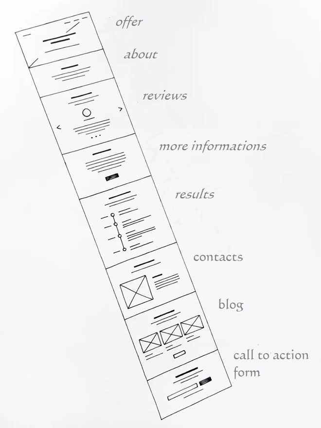
Making a prototype
This is not a design yet, but it is at this stage that the layout of the future site is drafted. A prototype is a framework through which we can see the structure: size, number of blocks, arrangement of elements, their format (video, text, images, infographics).
Prototyping solves two main tasks:
- allows you to visualize the layout of all blocks by laying out ideas in a tangible format. If you keep everything in your head, you are bound to forget something;
- helps to visually assess how logically the structure is built, whether it is convenient for the end user.
The prototype is like a navigation map that helps you create the design and fill the landing page with content. This is the case when the focal point is not quality, but availability. The draft can always be corrected, new ideas can be added. Without it, you are sure to miss something important and you’ll have to essentially create a landing page with nothing to go on.
The prototype can be drawn by hand on a piece of paper or created in Word, Photoshop, or another similar program. There are special applications that simplify the process: MockingBird (online), Axure, Photoshop XD.
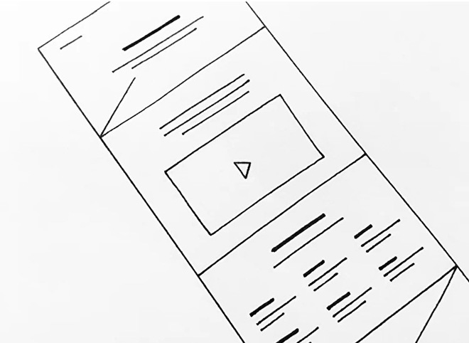
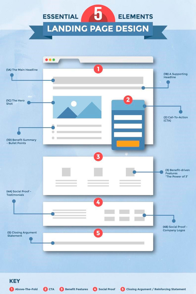
It is at the stage of prototyping that it is worth laying down a promotion strategy and identifying the main elements of a landing page:
- USP – a clearly formulated unique selling proposition.
- Benefits of use – hit the main desires of a specific TA, don’t overdo it though, otherwise the text will turn out simultaneously for everyone and for no one.
- Leaf forms (call to action): buttons for requesting a callback, forms, links to follow.
- Trust triggers – blocks that should remove the user’s fears: reviews, letters of thanks, success stories, cases, time counters.
- Calls to action (CTA) – the final chord that should transparently make it clear to the visitor what is required of him. Example: “Do you want to be the first to know about new products? Subscribe ”. “Want a new iPhone first? Leave a request ”.
- Bonuses, prizes, gifts. For example, a discount if you place an order within an hour. This is an additional incentive for those who still harbor doubts.
- Removing objections – the final trigger of trust: a return guarantee, a discount if delivery takes longer.
Try thinking “in screens”, one screen is one block with a completed message. This makes the information much easier to perceive, and the site looks more attractive. When developing, schematically fill the blocks up with content: infographics, photos, videos, text.
Working on the text
Frankly, it’s best to hire a copywriter for the text part – more than half of the conversion depends on the content. But an affiliate marketer has to make dozens, hundreds of landing pages. Therefore, sooner or later, you’ll need to learn to do it yourself. There are entire courses on how to write awesome landing page texts. This is a topic, perhaps, for a series of articles. Therefore, I will only go over the main thing here.
Main moments:
- Brevity is the soul of wit. The landing page should be laconic – no one will read novels (there are books for that). You have 40 seconds, 2-3 minutes if you’re lucky. During this time, you need to hold the user’s attention and convince them;
- The landing page should take all the issues of the table. If a user leaves to check or clarify confusing or shady moments then odds are that you lost them: they’ll get distracted, change their mind, go to your competitor;
- Copywriting and prototyping are in a way the same process. Try to make the text blogs fit the prototype and vice versa, make the prototype fit the text;
- Use objective arguments and arguments, no vague phrases. “This is the best dating website” – is really bad. “126 couples are born every day on a dating site” or “80% of people on this site find a soul mate in the first month” – is much better;
- Use infostyle – your text should be laconic and honest (as much as possible), services like glvrd.ru and Turgenev-Ashmanov can help you with that.
Start working on the text by preparing the foundation: create user portraits, make a list of questions, fears and desires, think about how they can be handled. And peek at the texts of your competitors…

When working on a landing page, remember that a website is, first of all, a story. So feel free to adjust the prototype taking into account the written text. Better to spend a little more time drafting the story than having it interrupted at some point.
It is better to write an article in stages:
- draw up a plan, come up with a structure;
- write the offer – you need to fit the whole point in one (okay fine, but no more than two or three) sentences;
- write the text itself, it must be convincing, give arguments, use trust triggers;
- optimize the text – re-read it, remove all the unnecessary elements, add new ones.
Re-read the text several times. Make sure it organically fits into the surrounding content – start with the easier stuff: what goes where, who will it interest, benefits, arguments in support of merits, info about the company.
Example: an online casino for cricket fans with a wide lineup and high odds. The company has been on the market for 20 years, all bettors note the quick calculations, the winnings are paid out within an hour.
If you’re creating your first landing pages, you don’t have to do everything from scratch. You can “borrow” successful pages from your competitors, edit or rewrite them. But remember, you shouldn’t blindly copy, you can always make it better.
Design
Design comes last in the list of stages because … It’s not the main thing. Especially in a landing page, where we only need the user to perform one action: click the buy button or subscribe to the newsletter.
True, a cool design will benefit conversions, after all, large corporations don’t spend millions on landing pages for bleeps and giggles. But here Parreto’s law is best manifested: 20% of the time and effort provide 80% of the result.
It is enough for an affiliate marketer to take into account these basic tenets and rules. If you ignore them, the visitor will simply close the page and not read your story. But pretty pictures alone won’t make the user subscribe or buy your slimming powder. The landing page’s job is to showcase the product.
Key points to keep in mind:
- No more than three primary colors, too colorful designs are annoying, the visitor will leave before reading to the end;
- a bare minimum of distracting elements: don’t oversaturate the page with widgets, choose a solid background;
- make sure the text is ready to read. Light text on a black background looks impressive, but it tires your eyes fast. You can design the main offer screen in such a manner; where you need to put more information, make blocks with a light background;
- no more than two fonts and two colors (you can use different shades of the same color);
- insert high quality pictures. Even one low-res picture will kill conversions. You can find free photos on popular photo stocks, for example, here: www.splitshire.com.
The fonts should be easy to read even if the person is just skimming through the text. They should open correctly on all devices. Don’t overdo it and just pick from Google Fonts, they display correctly on all browsers. Use simple fonts such as Open Sans, Noto Sans, PT Sans, Frank Ruhl Libre, Playfair Display. Designer fonts like Arvo are fine for main headings if it’s for the sake of brand awareness.
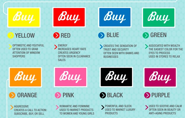
Keep in mind that colors evoke different emotions and associations. Black builds up trust, it is suitable if you need to emphasize a luxury or exclusive status. Red motivates to do something, suitable for the Call To Action (CTA) block. Orange is the color of energy, fun, joy. Yellow symbolizes youth, optimism, is suitable for attracting a younger audience. Blue, gray – soothe, help relieve fears or doubts.
When developing a design, you can choose a ready-made template and edit it to fit your needs, replacing the pictures and photos. Sites that look like slides or screens are better perceived and are more credible. Go for a responsive landing page that adjusts to the screen size, device type.
How to make a good landing page?
Unfortunately, there is no universal good landing page for all occasions. The Internet is changing, and with it so are the needs of users. What worked before quickly loses its relevance. Therefore, you’ll always need test runs and constant market monitoring.
There are several general points to keep in mind.
A good landing page:
- evokes curiosity, retains the user’s attention and deals with all their doubts;
- won’t give the user time to come to his senses and go to other sites in search of extra information;
- motivates the visitor to perform the action you need them to;
- is dedicated to one product or event, created for a specific audience, for a specific action;
- follows a simple pattern – you came, you saw, you understood, you bought.
Usually the structure of landing pages is compiled according to the AIDA formula: offer – enticing information – develop the notion – relieve doubts – CTA. For example: weight loss capsules – lose weight without a diet – from 2 to 7 kg in 30 days – FDA approved – reviews – order through this link/phone number.
An alternative formula is PMPHS: problem, aggravation, hope, solution. For example, gained extra weight – diets don’t help, cause stomach problems – forget about diets – pills will help you lose from 2 to 7 kg per month.
These formulas are not universal, somewhere one format works better than the other, in another place – vice versa. But these landmarks will help steer you in the right direction.
Fortunately, there exist more objective indicators of landing page quality that can be measured. Remember that the whole point of affiliate marketing is making a profit. So, look at the numbers:
- page view time;
- bounce rate;
- conversion.
Various tools help to assess the effectiveness of a landing page: most online designers and CMS have built-in analytics. More detailed statistics are provided by specialized systems. For example: Google Analytics, Yandex.Metrica, K50, Serpstat, Oribi, SimilarWeb.
Popular trackers have powerful analytics tools: CPAtracker, AdsBridge. You can evaluate CR of different design options using A/B testing – first one landing page option is shown, then another. Then the audience response is compared. Most online builders (bloxy, tilda, GetResponse) also have this feature. More flexible tests can be performed through specialized services (for example, Kameleoon).
Common mistakes
- the landing page needs to be long – it does not. You need to talk about the product in detail – this means settling all the user’s doubts whilst not creating new ones. Ideally, you should try to get your message across in one screen;
- special, spicy text – sometimes it works, but in popular conversion ares (gambling, dating, nutra, commodities, finance) the simpler it is written, the better;
- a countdown timer – once it was a solid must-have technique, but now users have figured it out and such counters only push people away, not motivate them;
- vague USP – this sounds obvious, but the user must understand what is being sold to them and what they need to do to get it;
- a long list of advantages – no one will read it, 3-5 points are more than enough;
- many distractions: clocks, calendar, blocks with pictures, widgets, colorful text with different fonts – this is what websites looked like in the 2000s, they won’t work the same 20 years later;
- several targeted actions. This technique works on regular websites, a landing page has one goal and offering multiple choices only delays the decision-making moment, as a result, the user is likely to just leave without making a single one;
- the landing page doesn’t match the ad. For example, a banner advertising “quick money” redirects the user to a “quick loans” or “online casino” landing page;
- complex feedback form – don’t ask too much, not all users are ready to leave even a mobile number. If you ask for an address, marital status – expect a refusal. The ideal form asks only for the user’s first name (no last name) and email address when they are subscribing to something. Or their mobile number, messenger if it’s a commodity form.
Developing the landing page: composition
Now to the main thing: how to assemble a landing page? There are three ways:
- download a ready-made html + css + js template and edit it to fit your needs. For editing, you can use special applications or the visual editor built into the CMS. You can download universal templates or ones adapted for a specific control system. You can find a large selection of templates on bootstraptema.ru or psd-html-css.ru;
- online landing page builders allow you to build a website from scratch in a few minutes by dragging and dropping blocks, or edit one of the ready-made templates. The advantage of such constructors is that you get hosting, analytics, promotion and testing tools all in a single service. Popular builders: Tilda, Wix, GetResponse, uKit, SitePro, WordPress, Google Sites;
- offline landing page designers are visual editors that allow you to create a multi-page website or a one-page landing with coding or even knowing how to. After that, all you have to do is save and upload the website to a hosting. Popular systems: Adobe Muse, Dreamweaver, Mobirise (free), WebSite X5;
- code from scratch. This is the most difficult and least productive option. You will have to go through gigabytes of information and learn several software programming languages: HTML5, css, js, jawa. Even though knowing basic HTML is good for any affiliate marketer, there’s no point in delving into the topic, unless you plan to become a web developer further down the line.
When working on a landing page, you shouldn’t focus on how fast you make them. Many webmasters follow the formula – the more campaigns you manage to launch, the better the return. As a result, the landing page creation process takes 5-10 minutes which seriously impacts quality. Since the conversion rate is very small, the profit is measured only in 1-5 measly percent. To make at least some money, you’re forced to launch dozens of campaigns and bloat multi-thousand budgets. It’s impossible for one person to keep track of all that – you’re forced to use services that automate the work process, further increasing the size of investments needed.
It is better to launch 3-5 landing pages, milk them and squeeze out the most potential, achieving a conversion rate of 10-15%. The high ROI will ensure you get good income even with a modest advertising budget.
Important points
Speed
Loading time is a critical parameter. If the website doesn’t load in 3 seconds, 30-40% of users will close it. If it hasn’t loaded in 5 – 75% of your traffic is gone. 75 out of 100 people won’t wait, so even the best landing page in existence won’t produce the desired result. But each click was obtained with great effort, the advertising budget was spent on it. So thoroughly test the loading time. Tools like Pingdom or PageSpeed Insights can help you do that. If the site takes too long to load, optimize it: clean the code, remove unnecessary dynamic elements, launch visual effects through TinyPNG.
Adaptability
Don’t forget about mobile apps. In recent years, their share has been constantly growing, and now in most niches the percentage of transitions from smartphones or tablets ranges from 50 to 70%. You can create separate landing pages for PCs and smartphones. But websites that can adapt to the device type are just as good. What’s even better, they save development time, reduce hosting and domain costs.
Be careful with WordPress templates
This is the most popular constructor and CMS, of course hundreds of thousands of templates have been written for it. The creators of the paid versions promise sky-high conversions, but in fact, most layouts are talentless copies that will not provide the expected results. The ideal formula looks like this: check what ads of your competitors are successful, choose a free template that suits the ad’s structure. You have to like it, that’s a prerequisite – if it’s not “love at first sight”, keep looking. When you find the one your heart was looking for, edit it to better fit your particular ad.
Let’s sum up
Landing page design is a creative process that requires perseverance, the ability to look for bits of information, analyze and connect them. First of all, it is important to understand your target audience, its insecurities, interests, fears and deal with them accordingly, find benefits for specific users. This is what results in conversions, not the way you lay out your message or a pretty design. The deeper you investigated the market, the higher the chances of hooking the user.
The technical side is almost a formality. With a huge selection of ready-made templates, free and paid tools, you don’t need to spend days coding by hand. Constructors with visualized editors automate the process. All you need to do is assemble blocks according to a previously prepared layout, add pictures, insert text. It will take no more than an hour to set up.