Any self-respecting affiliate program develops landing pages for each offer. Just pick it up and start driving traffic, but… If 1,000 affiliates all drive traffic to a single landing, only the first “skims the cream”, and the rest are left with either a drained budget or the realization that they need to create their own landing page. But even when the landing page is linked to your domain, the conversion rate leaves much to be desired, for some reason.
Let’s put aside ad campaign settings configuration options: people click the link and get redirected to the landing page. However, they still don’t perform the target action (ordering goods, making a purchase on the website, registering). To increase the conversion rate, you must turn to the landing page and identify its defects.
Table of contents
What’s a good conversion rate for a landing page?
The conversion rate is the ratio of the number of users who performed the target action to the total number of landing page visitors, expressed as a percentage. This is the landing page’s efficiency indicator, similar to the efficiency of a salesperson in a store. Except, in the case with the landing page, the “seller” is actually the page’s designer, who’s playing God and controlling the mood of the crowd.
Example: 1,000 clicked the ad and got sent to the landing page, with 16 of them placing an order.
Conversion rate = 16/1,000*100% = 1.6%
1-2 people out of 100 performed the target action. And there’s no telling how many more will drop out during the call-center verification phase. Whether this conversion rate is good or bad depends on the ad expenses and on the profit received – i.e. ROI is ultimately more important than the conversion rate itself. But in any case, a 1.6% conversion rate is pretty average, which is sad – you drain your ad budget without making any profit. That’s why you increase the conversion rate and the ROI along with it by improving the landing page itself.
Top 10 tips for improving landing page conversion rates
You should have your own unique landing page that stands out from those of your competitors. Even if you’re forced to use the one offered by the ad network – make some time, add a few edits that will , ultimately increase sales. A mobile landing page has its own characteristics, which must also be taken into account, in more detail about this here.
Pay attention to the headline
The first thing a client sees when they visit the landing page is the title. When creating a page, you can swap around blocks, background and images, add GIFs and buttons, but if there’s no catchy title, the conversion drops 10(!) times.
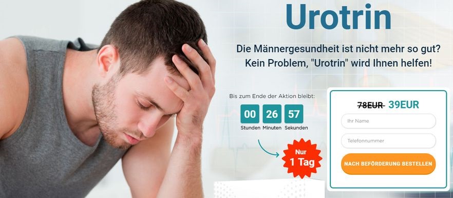
A headline like “Is your male health deteriorating? Urotrin will save the day!” will work poorly. No specific benefits and “male health” is too vague a concept.
A headline is a well-composed unique(!) selling proposition (USP). It can have a subtitle that is more wordy and covers more details, and its main task is to make sure the visitor stays, convince them to read on. This can be done by:
- Highlighting specific benefits:
- Saving electricity by 30%;
- Losing 10 kg with a guaranteed result (2 benefits – 10 kg and a guarantee);
- A 50% monthly income increase…
- Intriguing the visitor:
- Find out why Kim Kardashian is considering investing in bitcoin.
- How to hit the jackpot
- Why does the European bodybuilding champion take N.
- “You” – orientation. Only the needs of the client and a solution presented on a silver platter work. The potential client wants to know how to become rich. It would be a mistake to include only “the coolest investment course” in the title; it would be more correct to add the subtitle “after the end of the course, your monthly income will increase 8.5 times.”
- Taking advantage of emotions for inexpensive short cycle products(sex, relaxation, weight loss, entertainment). But don’t overdo it with fear.
- Relaying user search queries.
If you’re still struggling to create something that would stand out from your competitors, you can use one of the effective headlines models:
- “Double benefit”, a combination of the offer’s strongest advantages. Lose 10 kg in 2 weeks, earn $500 in 2 hours, book a suite with a 70% discount in 3 minutes.
- “Maximum benefits with minimum effort.” Putting pressure on people’s emotions:
- How to lose 5 kg in 2 days without dieting and getting up from the couch.
- How to increase income by 100% by investing $1 per month.
- How to launch a hit business from scratch without money and stress.
- “Intrigue”:
- Who does the dentist call if he has a toothache?
- What does the endocrinologist take if his weight begins to grow?
- Why is the Tibetan Dzi bead the best investment?
Did you write the headline and are taking a breather? We got bad news for you – you’ll have to do it again. Well, not the headline, but rather a second level headline, the one that precedes every(!) logical bloc of the landing page. This is something newbies often neglect. You need to rewrite the main headline and not break any of the rules, but by using different words.
The “benefits” bloc – a must have for any landing page
A correctly formulated benefit ignites the desire to take advantage of the offer. And it mirrors the title, because the block should contain specifics, emotions and “you” -orientation. A well-presented benefit can replace a headline – but this is a trick for experienced marketers: it’s best beginners make a landing page that contains both a headline and a benefits section. And only after do you add the creative.
The shorter the benefits, the better. There mustn’t be ANY complex phrases or difficult to pronounce words.
Example: “Get a master’s thesis within 24 hours” – the benefit “quickly”.
Price: when “less” does not mean “better”
We are not talking about the product’s price. The price can be highlighted in a separate block, or it can be indicated in the title and benefits section. You can choose not to specify it at all (it depends on what you plan to sell and to whom), but you need to understand how to correctly voice and present the price.
| 1,000 dollars | Writing the number in full stretches out the price, presenting the purchase as a highly lucrative endeavour. It’s psychology, when you say the whole phrase, there is a feeling of significance. |
| 1k d. | Visual price drop. Used when you want to psychologically lower the price perception. |
| 1,000.00 | Making the price appear enormous and high ROI. |
| Only $10 a day | Payment by installments for 90 days. |
| 999 dollars | A pseudo-discount. ATTENTION: everyone is so tired with this little trick that it repels clients rather than attracts them. To increase the price, use the numbers BELOW 6. To lower it, use the odd numbers 7 and 9. highlighting them against the background of the general text. |
| Crossing out the price means highlighting the benefits. The benefit in red and the crossed out number in pale colors (gray) to further emphasize the value. |
Additionally, the sales price with a pseudo discount is increased in size and jumps out at the user.
Take notice:
- 99.9% of the goods on landing pages come with a pseudo discount. Why such generosity? The cost reduction must be justified, for example, “In honor of the company’s birthday, we give all customers a 50% discount.” Any reason will do; it helps win over the user’s trust.
- Discounts must be quoted in monetary terms, not percentages. Compare “save $1,000 per month” versus “save 14% per month”. Psychologically, the first option is perceived as more lucrative.
Appealing to the people
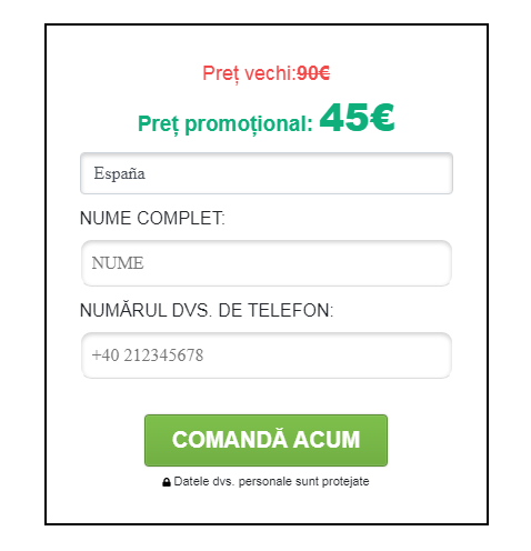
The call to action (CTA) is a block of the form for collecting contact info for the order or in return for something (a price list, catalogue, gift). There are only 2 main rules here: the value (the reason for it) is placed above everything else, and the number of input fields should be minimal.
Here are the models that perform well:
- Do something BEFORE a certain time and get something tasty in exchange. Examples:
- Download the free version today.
- Order before 15.00 and get an additional 15% discount.
- Do something BEFORE a certain time:
- Send it right now.
- Register today.
- Do + benefit:
- Get the best tour.
- Win an iPhone.
The page may contain an additional call to action when the customer is not ready to pay right now. In exchange for his email, you can offer an ebook, and then send them reminder, including push, ads.
A good image is half the battle
The landing page must have at least 3 high-quality images that reflect the BENEFIT the user gets from the purchase, the result. For example, smooth legs after using an epilation cream, elderly people running on a sports track (rollerblading) after taking stimulants, a large phallus after applying a cream. You can turn everything into a joke using an associative array, add GIFs and cartoony images, but a high-quality photo (not from a photo stock) is the best choice.
You need to focus on the main target audience: if the product is bought primarily by young people (15-18), it would be wrong to use photographs of 40-year-olds: the actual buyers won’t identify the product with themselves and their own needs.
Top 3 working images:
- “Cakes”, appetizing food (I can eat this).
- Images that provoke fear.
- Good-looking women and children.
But always play around the product and your audience. For single men, use women and dogs, and for teenagers – dinosaurs and pop stars.
Showcasing the product
This is NOT the most important thing on the landing page, sometimes the client’s imagination will do the work for you, at times so well that the image it creates will convince the user to make the purchase. You need to talk about the benefits of the purchase, not just present the product, and the image must be relatable for the user.
The task of the landing page designer is to get a high-quality and vivid image that’s also as light as possible. Use Photoshop. First create a new image at 1 ppi and then save it as a jpeg file at not the highest quality. Usually, 90% and 75% do not differ much visually, but the size is smaller.
In the image description you need to turn characteristics into benefits. For example, a 2 meter tall Eustace teddy bear (2 meters is a very big toy). Still, don’t overdo it, mention only the top benefits.
Read more about using landing page builders here.
We guarantee…
A warranty section increases the conversion rate, but you have to be careful, somewhere at the bottom write out in fine print strict conditions that must be met for the warranty to apply. Otherwise, you can go broke. Examples:
- Hot pizza within 30 min or it’s free!
- 100% refund if you haven’t received the desired result after a month.
To amplify the emotional impact, break the phrase down into several parts. “Didn’t like the product? Did you wait 20 minutes for the manager’s call? The courier messed up the delivery? We will refund 100% of the cost.” The client sees a triple guarantee and no longer has any doubts.
Word of mouth
Word of mouth sells: 65% of social media users buy products their friends recommend. That’s why the landing page must contain a review section, one that you’re probably going to have to write yourself.
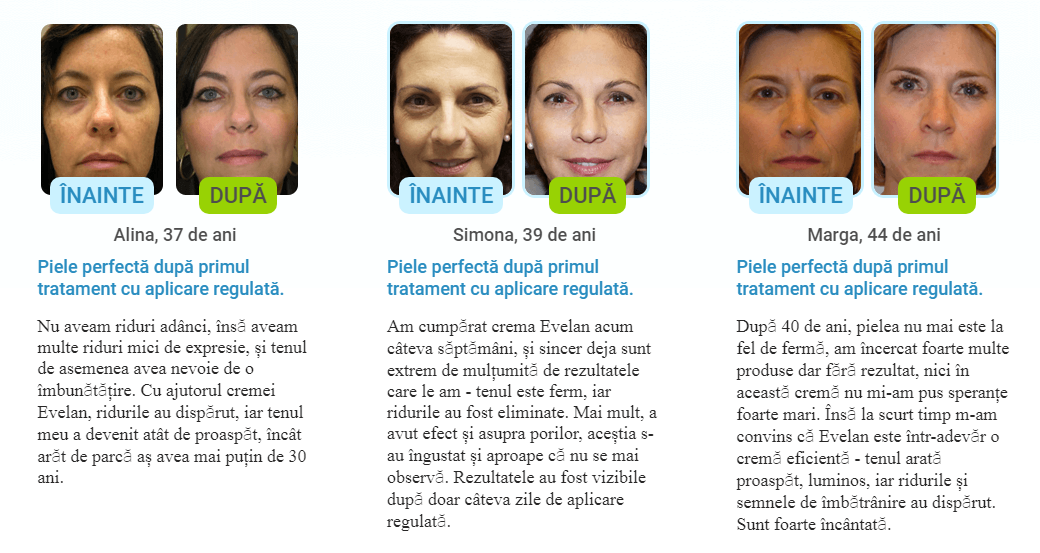
Text deals with user concerns regarding whether the product will work on medium and deep wrinkles, enlarged pores, even if the person has a reduced tone.
The review must look real (name, last name, workplace position, social media link (careful!)). Except, you don’t need to mention the position if you’re promoting computer games, for example. A logo is used for a company, a photograph – for an individual.
Attention: add a call to action button to the reviews section, for example,”I want one too!” or “Order”.
Videos
Bad videos lowers the conversion rate and annoys users. Unless it’s part of a specific sort of review, the video should be professional, no more than 3 minutes in length (ideally 1.5 minutes). And it should focus on the merits that are not indicated in the text, showcase the product’s details and quality.
SOUNDLESS videos find a better response: users have grown accustomed to such videos in social media. Don’t make it HD: not everyone’s Internet can handle it, in which case the user will just leave .
Landing page text reviews perform 30% better than videos. Therefore, it is best to use a combination of “text, video and image”.
Pre-landing page
Pre-landing – a first-person case, a success story. Basically, it’s a more detailed landing page with a catchy headline and subheadline. It is often neglected, but the more expensive the product, the more convincing text you need to include. The magic of words. But the copywriter must be qualified, inspire trust, understand the needs of the audience and not write nonsense like “this electricity-saving device affects the electrical meter using torsion fields that unfold the magnetic field and force the wheel of the device to spin slower.” The text may seem “smart”, but if the target audience knows even a little about physics, the conversion rate will flop.
You should also avoid using phrases like “native cream” in biology, native means having preserved the structure of a living cell), a pretentious gadget. Use them only when you’re 100% sure your TA uses them as well.
The pre-landing is made according to the following pattern:
- A problem that elicits an emotional response.
- An “easy and simple” solution.
- Dealing with objections.
Conclusion
Remember a simple rule: each element of the landing page must not only attract and hold the user’s attention, but also increase their desire to make the purchase/register immediately, right after reading the ad. Try to critically assess the landing page, make changes, and the conversion rate is guaranteed to increase.